Some links in this blog are affiliate links. If you make a purchase through these links, I may receive a small commission. This helps support the site at no extra cost to you.
Your living room is the heart of your home—a place to relax, entertain, and make lasting memories. And one of the best ways to elevate this space is through color.
But choosing the right shade can be daunting with so many options available. The good news? We’ve got you covered with the top 7 trending living room colors that will not only make your space feel inviting and modern but also add a fresh breath of life to your home.
Did you know that color psychology plays a huge role in influencing our mood and behavior? Whether you’re seeking calm, energy, or creativity, the color on your walls can help set the tone for how you feel when you step into the room.
If you’re ready to transform your living room into a stylish sanctuary, read on to discover the most popular colors of 2025 that are making waves in interior design!
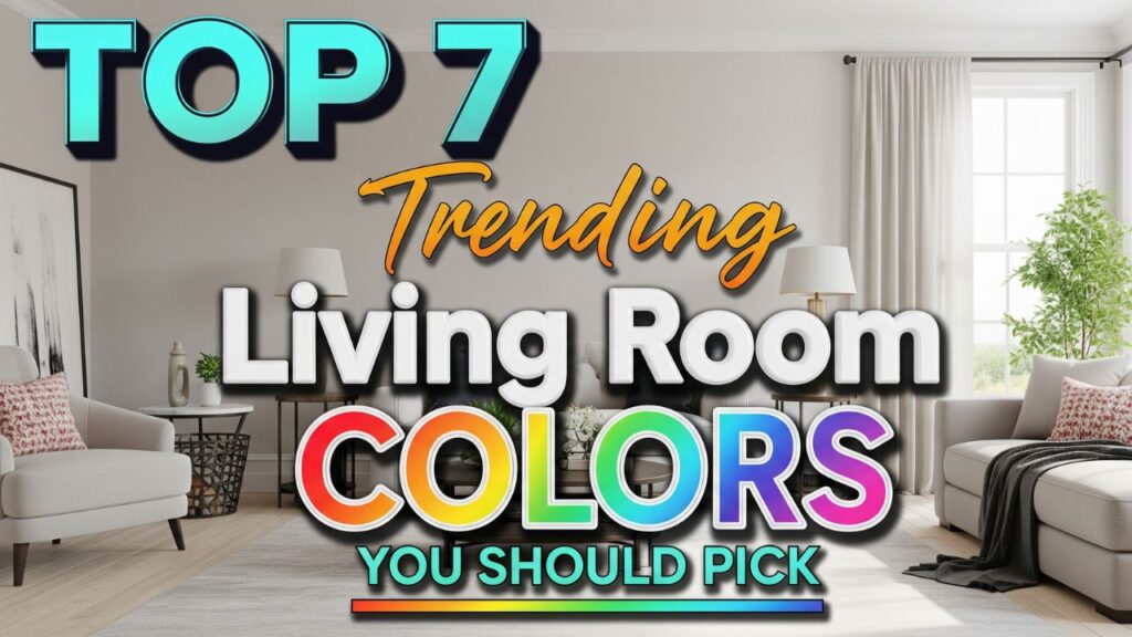
Table of Contents
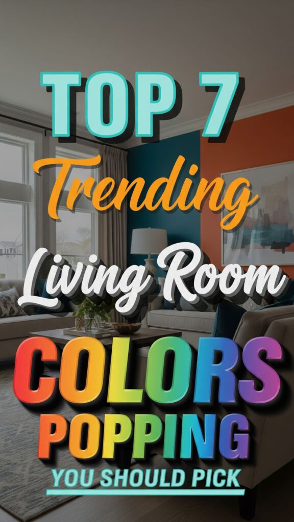
7 Best Living Room Colors
1. Soft Sage Green: The Color of Tranquility
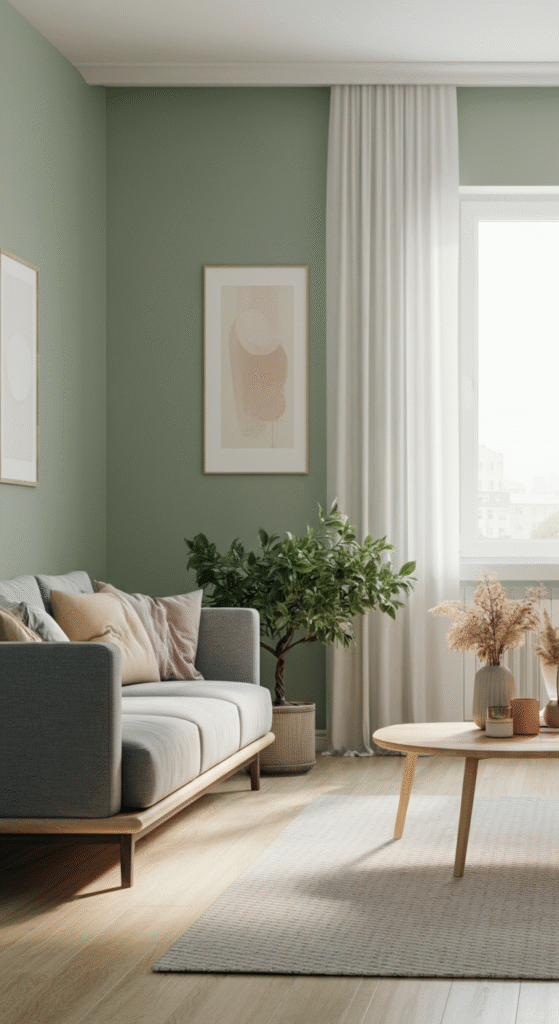
In recent years, shades of green have taken the interior design world by storm, and for good reason. Sage green, with its soft, muted tone, is one of the most serene colors you can choose for your living room. It exudes a calm, earthy vibe, making it an ideal choice for anyone looking to create a peaceful, relaxing atmosphere.
Why Sage Green?
This color brings nature indoors, offering a refreshing connection to the outdoors without overwhelming the senses. It pairs beautifully with natural textures like wood, linen, and stone, which further enhance the calming effect.
Do you know that the color green is associated with balance and harmony? It has been shown to reduce stress levels and promote a sense of calm. If you want your living room to feel like an oasis, soft sage green is the way to go.
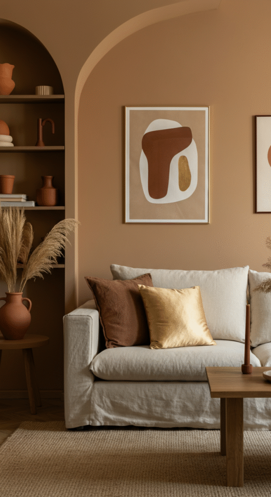
2. Warm Terracotta: Earthy and Inviting
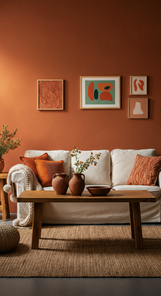
Terracotta is another earthy color that’s rising in popularity. It brings warmth and depth to any living room, creating a cozy, inviting space. The warm orange-brown hues of terracotta can make your living room feel grounded and welcoming, especially when paired with modern or bohemian decor.
Why Terracotta?
Not only does terracotta evoke feelings of warmth and comfort, but it also works well in a variety of design schemes. Whether you prefer minimalist, rustic, or eclectic styles, terracotta is versatile enough to complement any aesthetic. It also pairs beautifully with neutral tones, wooden accents, and green plants for a balanced look.
Fun fact: The use of terracotta in home decor goes back centuries, especially in Mediterranean and Southwestern regions, where the color is inspired by natural clay and sun-drenched landscapes.
3. Classic Navy Blue: Timeless Elegance
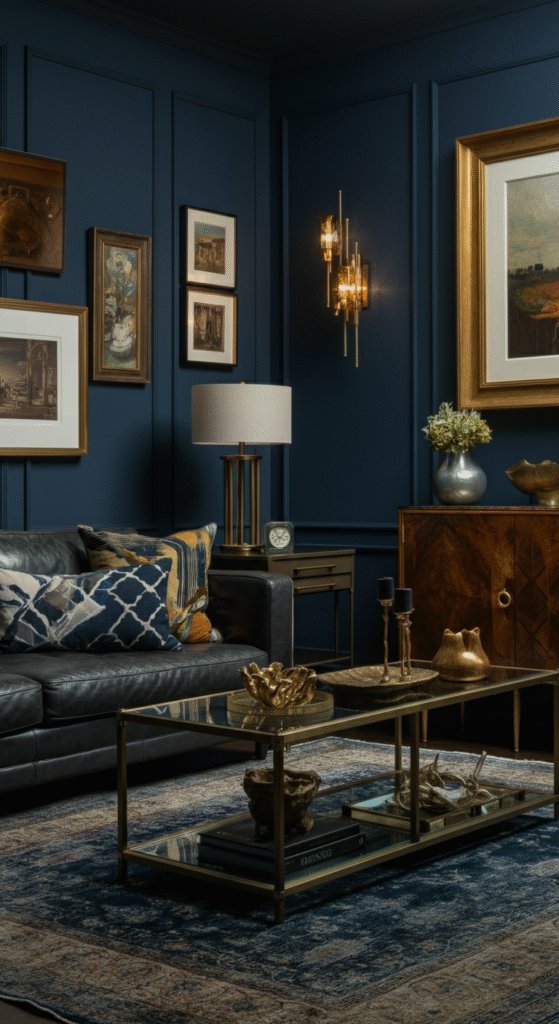
Navy blue is a classic color that never goes out of style. This deep, sophisticated hue can add a sense of luxury and elegance to your living room. It’s a great choice if you’re looking to create a bold, refined look without going overboard.
Why Navy Blue?
Navy blue is perfect for both large and small spaces. It makes rooms feel more spacious while adding a touch of drama. Paired with gold or brass accents, navy blue can make your living room feel like a five-star hotel lobby.
Do you know that navy blue is often associated with stability, wisdom, and professionalism? It’s an ideal color if you want to create a space that feels grounded yet still stylish.
4. Soft Taupe: Neutral and Chic
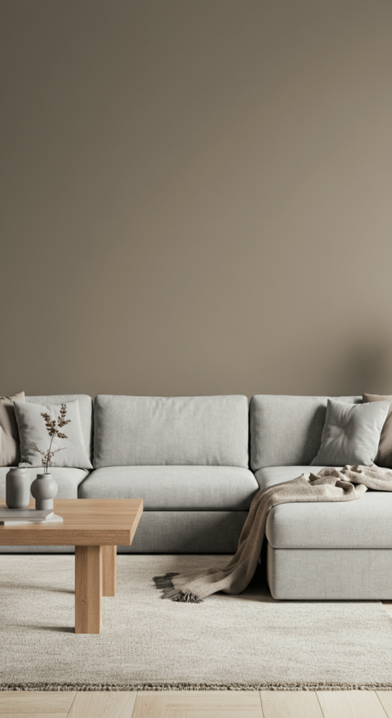
If you’re someone who loves a neutral palette but wants something a little warmer than classic beige, taupe is an excellent choice. Soft taupe is an understated, elegant color that adds a sense of sophistication without being too bold. It’s perfect for creating a timeless, chic atmosphere in your living room.
Why Soft Taupe?
Taupe is versatile and pairs well with a variety of accent colors, from soft pastels to deep jewel tones. Its warm, grayish undertones make it easy to blend with furniture and decor, creating a cohesive, balanced look. Whether you prefer modern, traditional, or transitional decor, taupe is the perfect neutral background to highlight your favorite pieces.
Fun Fact: The name “taupe” comes from the French word for “mole,” as the color resembles the fur of the animal. It’s no wonder this earthy tone feels so warm and inviting!
5. Bold Charcoal Gray: Modern and Sleek
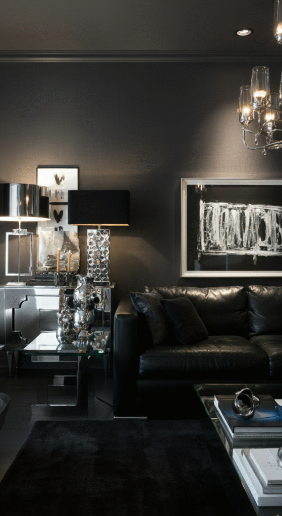
For a more dramatic, sophisticated look, consider charcoal gray. This dark, moody color adds depth and dimension to your living room, making it feel sleek and contemporary. Charcoal gray works well in modern and industrial designs, creating a high-end, polished look.
Why Charcoal Gray?
Charcoal gray creates a striking contrast when paired with light-colored furniture, such as white or cream sofas. It also serves as a great backdrop for colorful art or décor pieces, allowing them to pop and grab attention.
Do you know that gray is a neutral color that symbolizes neutrality and calm? It’s an ideal choice for anyone looking to create a sophisticated, balanced living space that exudes modern elegance.
6. Soft Lilac: Fresh and Playful
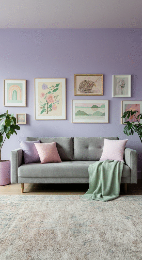
Lilac, a blend of light purple and pink, is a soothing yet playful color that’s gaining popularity in interior design. It’s perfect for creating a space that feels fresh and vibrant without being overwhelming.
Why Soft Lilac?
Soft lilac is both gentle and uplifting, making it ideal for living rooms where you want a sense of serenity, but with a playful edge. It pairs well with soft neutrals, like beige and white, and can also be combined with bolder hues, like gold or navy, for a more dramatic effect.
Interesting fact: In color psychology, purple is linked to creativity and inspiration, making it a great choice for spaces where you spend a lot of time thinking or socializing.
7. Warm Almond: Cozy and Inviting
Warm almond is a subtle yet effective color for creating a cozy living room environment. This rich, warm beige tone is both timeless and trendy, offering a versatile backdrop for a variety of design styles.
Why Warm Almond?
Almond is a neutral color that works wonderfully with various accent shades, from bright colors to more muted tones. Whether you’re going for a traditional, farmhouse, or contemporary look, this shade of beige offers a welcoming, inviting atmosphere. It’s perfect for those who prefer understated elegance that still feels homey and comfortable.
Fun fact: Warm, neutral tones like almond are often used in interior design to evoke feelings of warmth and relaxation. This makes them perfect for spaces like living rooms, where you want to unwind and enjoy time with family and friends.
Conclusion
Choosing the right color for your living room is more than just about aesthetics; it’s about creating an atmosphere that suits your lifestyle and emotional needs.
From calming sage green to bold navy blue, each of these trending colors brings something unique to the table. So whether you’re looking for a tranquil space to unwind or a bold, dramatic room to entertain, the right color can make all the difference.
When selecting your living room color, consider how it makes you feel and how it complements your existing furniture and decor. With these top 7 trending colors, you’re sure to find the perfect shade that transforms your living room into the space of your dreams
Frequently Asked Questions (FAQs)
What color is best for a small living room?
When choosing a color for a small living room, light shades such as soft sage green, off-white, or light taupe can make the space feel larger and more open. Lighter colors reflect more light, creating the illusion of space. You can also use accents in darker shades like navy or charcoal to add depth and dimension without overwhelming the room.
Can I mix bold colors with neutrals in my living room?
Yes, mixing bold colors with neutrals can create a balanced and dynamic space. For example, pairing a bold color like navy blue or terracotta with neutral shades like beige or soft gray helps to anchor the room and prevent it from feeling too overwhelming. This combination works well in modern, traditional, and eclectic living room designs.
What are the best colors for a calming and relaxing living room?
Colors such as sage green, soft taupe, and light blues are known for their calming and soothing properties. These colors can help create a peaceful environment, perfect for unwinding after a long day. Greens are especially effective for promoting relaxation, as they are associated with nature and balance.
Are dark colors like navy blue or charcoal gray suitable for small spaces?
Dark colors, when used thoughtfully, can work in small spaces. They add depth and sophistication to a room, but you should balance them with light furniture, mirrors, or natural light. You can also use dark colors on accent walls or as complementary shades to prevent the space from feeling too enclosed.
How do I choose the right living room color based on my furniture?
When selecting a living room color, consider the colors and styles of your furniture. Neutral tones, such as warm almond or soft taupe, provide a versatile backdrop for most furniture styles. If your furniture has bold colors or patterns, it may be best to choose a more muted or neutral wall color to avoid clashing. If you have a more neutral or monochromatic furniture set, feel free to experiment with bolder shades like terracotta or navy blue to add personality to the space.