Some links in this blog are affiliate links. If you make a purchase through these links, I may receive a small commission. This helps support the site at no extra cost to you.
When it comes to creating the perfect ambiance in your living room, the right paint color can work wonders. But with countless shades and hues to choose from, how do you pick the one that will stand the test of time?
If you’re looking to enhance your living room with a timeless appeal, classic paint shades might be the answer. But, here’s the real kicker—did you know that certain colors can make a room feel bigger, cozier, or even brighter without changing its layout?
In this article, we’ll explore the top 9 classic living room paint shades that have remained stylish for decades and will continue to do so for years to come.
So, sit back, relax, and discover how to transform your living room into a space that exudes timeless charm.

Table of Contents
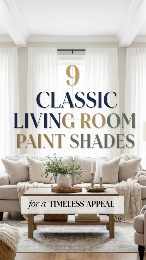
9 Best Classic Living Room Paint Shades
1. Soft Beige: The Quintessential Neutral
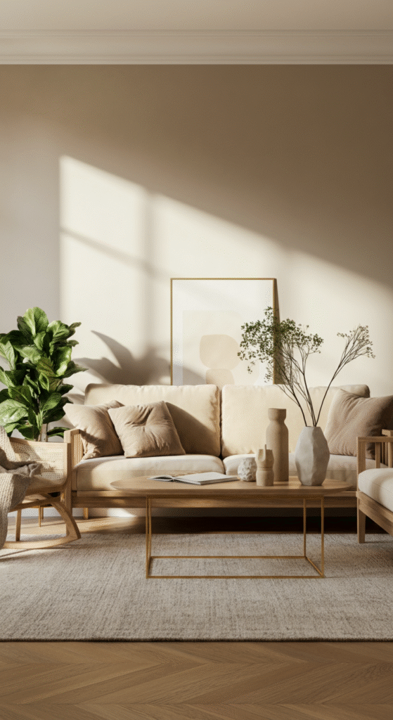
Beige has been a timeless classic for a reason—it’s versatile, calming, and pairs beautifully with virtually any style of furniture and décor.
A soft beige creates an inviting atmosphere that’s perfect for any living room, whether your style leans towards modern minimalist or traditional elegance. Beige also works wonders in making a room feel more spacious and airy, reflecting light and adding warmth to the space.
Did You Know?
Beige can have psychological effects on people, often creating a sense of calm and comfort. It is known to reduce stress and provide a neutral background that enhances other design elements in the room.
Pair beige with deep wood accents, lush green plants, and gold details for a sophisticated yet approachable look. Add a pop of color with accent pillows or artwork to bring life to the soft tones.
2. Classic White: Timeless and Elegant
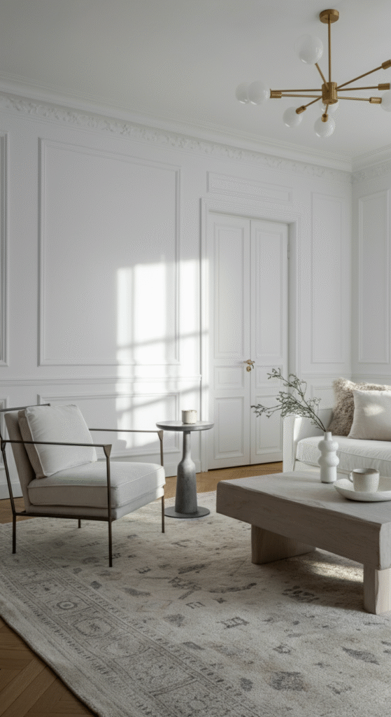
White may seem simple, but it’s undeniably one of the most classic and elegant choices for a living room. It’s clean, bright, and makes your space feel fresh and airy.
White walls allow natural light to bounce around the room, making even the smallest of spaces appear larger and more open. This makes it ideal for anyone who wants a light, airy atmosphere with a touch of elegance.
Myth Busted!
Some people believe that white is too cold or sterile for a living room, but in reality, when paired with warm textiles and textures like wood furniture, plush fabrics, and vibrant artwork, white can be incredibly cozy and inviting.
For a timeless appeal, complement white walls with neutral furniture and accessories in shades like soft gray, beige, and muted tones. You can also experiment with different wall finishes, like matte or glossy, to add depth and character to the space.
3. Subtle Gray: The Modern Classic
Gray is the perfect balance between light and dark, offering a sophisticated and contemporary look. A soft, subtle gray shade can make your living room feel peaceful, grounded, and stylish without overwhelming the space. This neutral hue pairs well with a wide range of accent colors, from bold blues to soft blushes, making it a versatile choice for all design aesthetics.
Did You Know?
Gray has become one of the most sought-after interior design colors in the last decade. Its timeless appeal lies in its ability to blend seamlessly with both traditional and modern décor, making it the go-to choice for many designers.
Pair light gray walls with rich wooden furniture for a chic contrast, or add metallic accents like silver or gold to introduce a touch of luxury. Gray also serves as an excellent backdrop for vibrant artwork or patterned throw pillows, allowing those design elements to pop.
4. Warm Taupe: Earthy Elegance
If you love the idea of a neutral palette but want something a bit warmer than beige, taupe is an excellent option. This earthy color brings a sense of grounded elegance to your living room while maintaining that classic vibe. Taupe is often described as a mix of brown and gray, offering both warmth and depth.
Interesting Fact:
Taupe is often used in upscale interiors because of its rich, earthy quality. It evokes a sense of luxury and comfort, making it a popular choice in both traditional and modern living spaces.
When paired with natural textures like wood, stone, and linen, taupe can create a relaxing, spa-like atmosphere. Accent this shade with soft, metallic tones like brushed gold or copper to add dimension to your space.
5. Soft Blue: Tranquil and Inviting
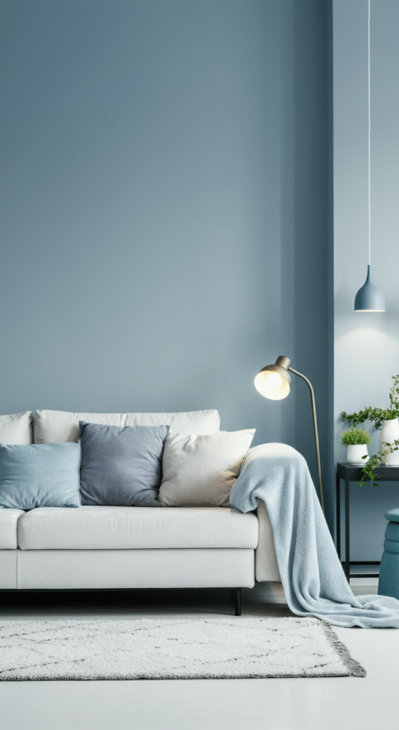
Blue is the color of calm, and soft, muted shades of blue work wonders in creating a serene living room. Whether you choose a light sky blue or a deeper navy, blue brings a sense of tranquility that’s perfect for unwinding after a long day. It’s ideal for spaces where you want to foster relaxation and a sense of peace.
Did You Know?
Soft blue shades have been shown to lower blood pressure and heart rate, which is why they are often used in spaces meant for relaxation, like living rooms and bedrooms. Blue can help create a soothing environment, making it a timeless color for your walls.
Pair soft blue with white or light gray for a light and breezy look, or combine it with dark woods and gold accents for a more traditional, luxurious feel.
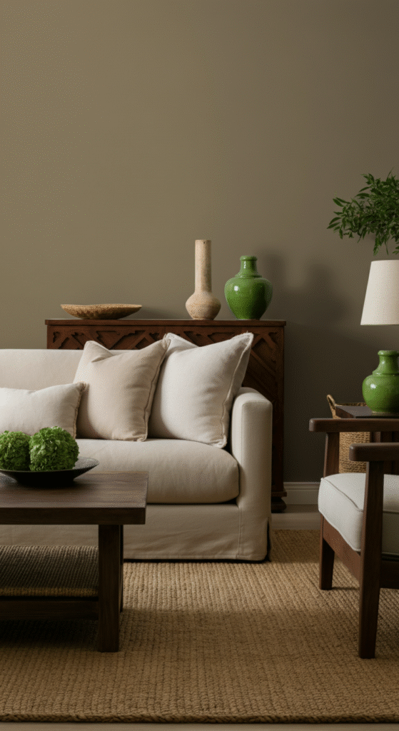
6. Muted Green: A Natural Retreat
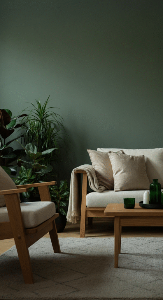
For a refreshing yet classic look, muted green tones are perfect for your living room. Shades like sage, olive, or eucalyptus bring the outdoors in and add a calming touch to your space. Green has long been associated with nature, balance, and harmony, which is why it’s often used in rooms designed to be relaxing and rejuvenating.
Myth Busted!
Some people think that green is too bold or overpowering for a living room, but when used in subtle tones like sage or olive, it can be incredibly soothing and versatile. Green works beautifully in both modern and traditional designs.
Pair muted green with natural textures like wood, stone, and woven fibers to bring a touch of nature into your home. You can also combine green with soft neutrals to keep the space feeling fresh and timeless.
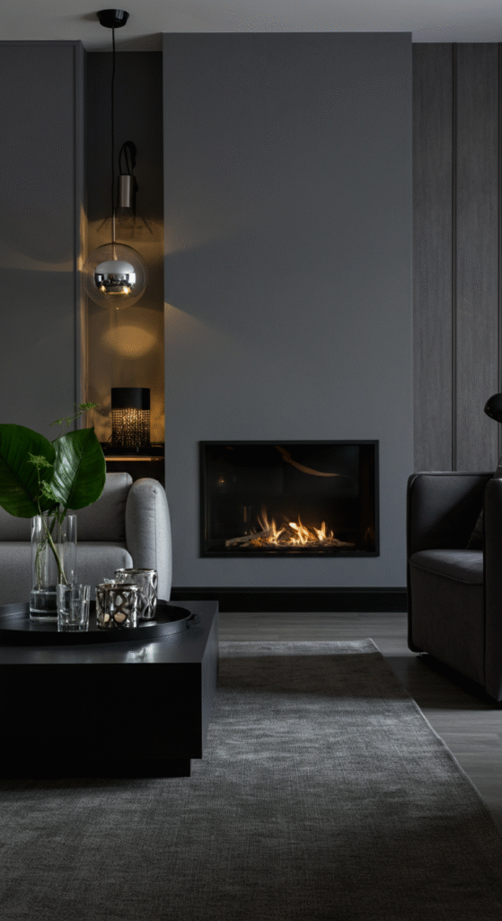
7. Rich Charcoal: Drama and Sophistication
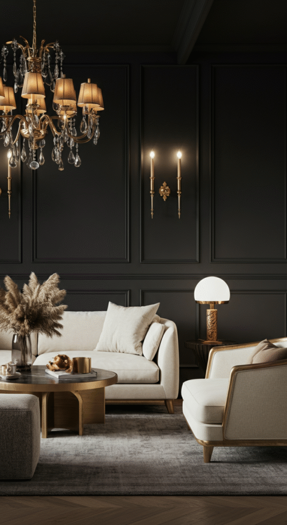
If you’re looking for a color that exudes sophistication and adds a sense of drama to your living room, charcoal is a fantastic choice.
This deep, dark gray brings an air of luxury and depth to any space. It’s perfect for creating a moody, intimate atmosphere, especially when paired with soft lighting and plush furniture.
Did You Know?
Charcoal gray is often used in luxury interior design for its ability to add depth and elegance without being as harsh as black. It’s a timeless color that never goes out of style.
Charcoal walls pair beautifully with lighter accent colors, like crisp white, gold, or soft blush pink, to create an elegant and balanced contrast. Add plush fabrics like velvet or silk to elevate the luxurious feel.
8. Warm Ivory: A Gentle Touch of Warmth
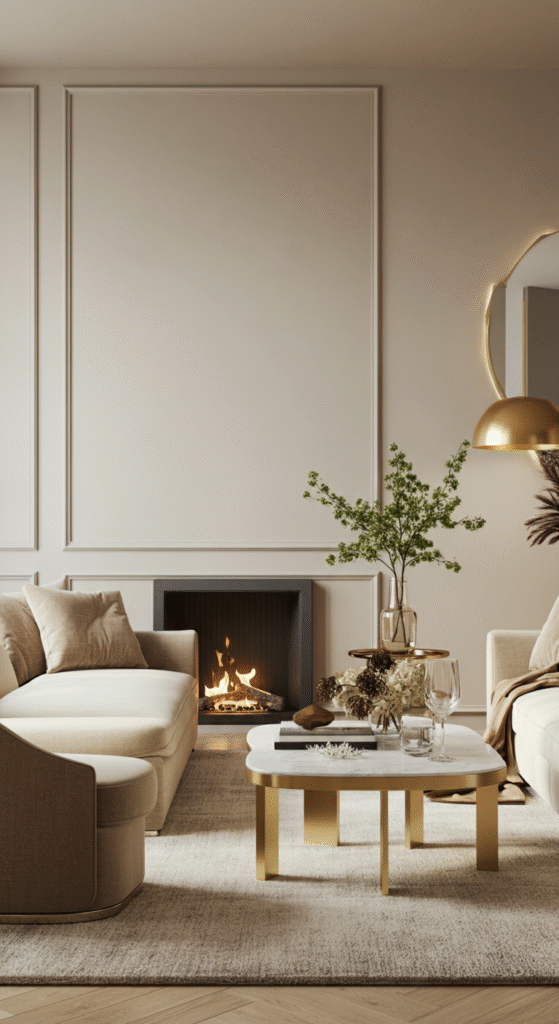
Ivory is a soft, creamy white with a hint of warmth, making it an excellent choice for those who want the elegance of white without the starkness. This timeless color brings a sense of purity and light to your living room, making it feel more inviting and cozy.
Interesting Fact:
Ivory has a rich history in interior design, often used in classic palaces and aristocratic estates. It was once a symbol of wealth and status, and it still holds that appeal today in modern design.
Pair warm ivory with soft neutrals or rich wood tones for a timeless look. For a more dramatic effect, combine it with deep jewel tones like emerald or ruby to create a luxurious contrast.
9. Deep Navy: Classic and Bold
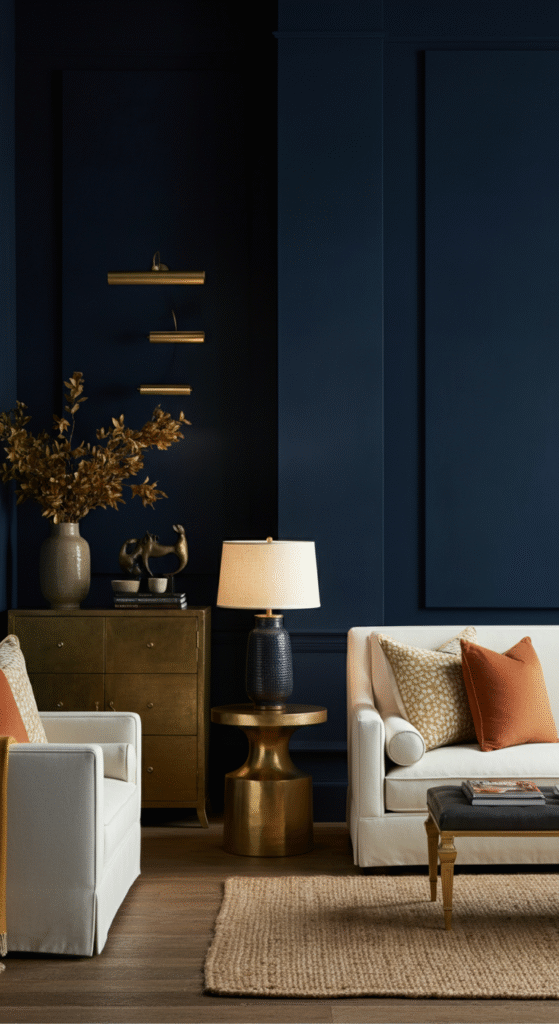
Navy blue has long been considered a classic color in interior design, and it’s especially popular for creating a bold, timeless look in living rooms.
This rich, dark hue adds depth and sophistication while still feeling inviting and cozy. Navy is perfect for creating a focal point in a room, whether it’s on an accent wall or as part of your furniture.
Myth Busted!
Many people shy away from dark colors like navy, fearing that they’ll make the room feel smaller. In reality, when used thoughtfully, navy can actually make a room feel more intimate and welcoming while adding a touch of elegance.
Combine navy with soft neutrals like beige or ivory for a balanced, refined look. You can also introduce metallic accents like gold or brass to add a layer of sophistication and shine.
Conclusion
Choosing the right paint color for your living room is more than just about aesthetics; it’s about creating an environment that reflects your style and enhances your lifestyle.
The classic shades listed above are not only timeless but also versatile enough to complement a wide range of interior styles and tastes.
Whether you’re looking for the serenity of soft blue, the warmth of taupe, or the sophistication of charcoal, there’s a shade here that will transform your living room into a space that exudes charm, elegance, and comfort for years to come.
Remember, the best color is one that resonates with you and makes you feel at home. So, experiment with these timeless shades, and create a living room that speaks to your personal style and timeless taste.
Frequently Asked Questions (FAQs)
Why is choosing the right paint color important for my living room?
Choosing the right paint color for your living room is crucial because it sets the tone for the entire space. The color you choose can influence the mood, make the room feel larger or cozier, and complement your furniture and décor. A timeless shade will also ensure your living room remains stylish and inviting for years.
What are the best neutral paint colors for a living room?
Neutral colors like soft beige, warm taupe, and classic white are ideal for living rooms as they create a balanced and versatile backdrop for a variety of furniture styles. These colors are timeless and can be easily paired with accent colors or textures to create the desired atmosphere.
How can I make a small living room look bigger with paint?
Lighter shades like soft beige, white, and light gray are perfect for making a small living room feel more spacious. These colors reflect light, making the room appear brighter and larger. Additionally, using vertical stripes or an accent wall can help create the illusion of height and space.
What paint colors are best for a cozy and inviting living room?
Warm colors such as soft blue, muted green, and warm ivory create a cozy and inviting atmosphere. These shades add warmth to the space without overwhelming it, making it a perfect place to relax and entertain.
Can dark colors like charcoal and navy work in a living room?
Yes, dark colors like charcoal and navy can work beautifully in living rooms. These shades add drama, sophistication, and depth to the space. When used correctly, they can make the room feel more intimate and stylish, especially when paired with light-colored furniture or metallic accents.