Some links in this blog are affiliate links. If you make a purchase through these links, I may receive a small commission. This helps support the site at no extra cost to you.
Ever walked into a room and instantly felt calm without knowing why? That’s the quiet power of warm neutral tones — they don’t scream for attention, yet they command peace and balance.
In the era of maximalism and loud design trends, minimalists have found their sweet escape in earthy, grounded palettes that whisper “less is more.” These tones aren’t just colors; they’re an experience — rooted in nature, timelessness, and emotional harmony.
But here’s the catch: most people think “neutral” means boring beige walls and nothing else. That’s a myth. In reality, warm neutrals are incredibly versatile, evolving with daylight, texture, and even mood. They breathe warmth into minimal spaces, turning simplicity into serenity.
So, if you’ve been craving a minimalist bedroom that feels cozy yet uncluttered, here are 7 warm neutral earth tones that redefine minimalism — and how to make them work beautifully in your space.
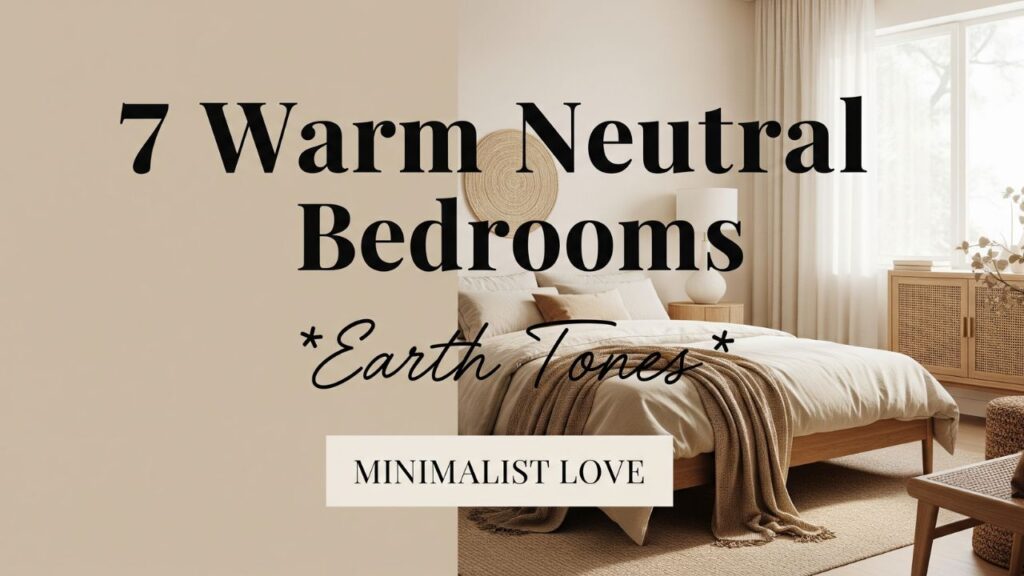
Table of Contents
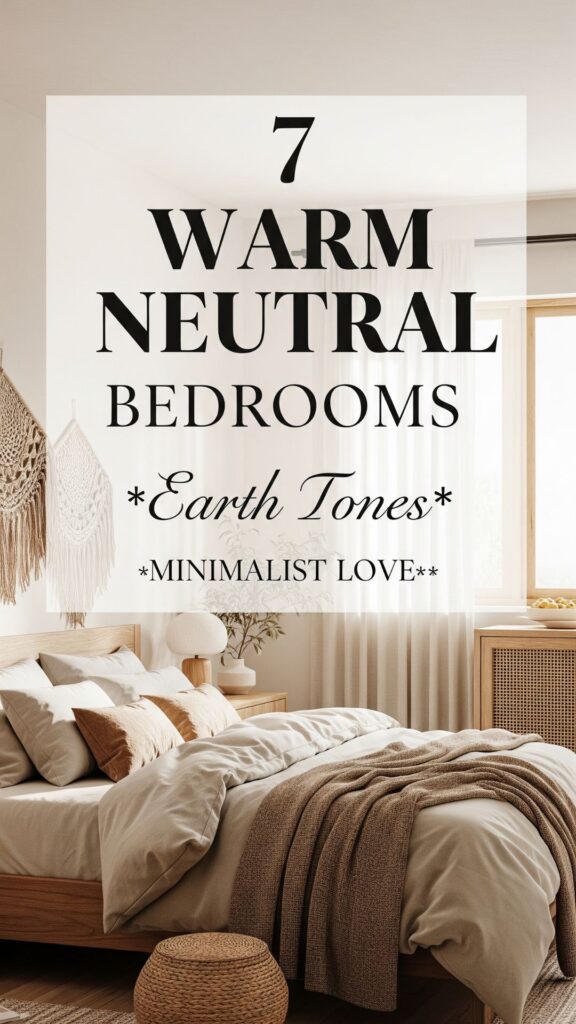
7 Warm Neutral Bedroom Earth Tones
1. Soft Sand Beige – The Timeless Foundation
Beige often gets unfairly labeled as dull. But in truth, it’s the most forgiving, adaptable tone you can have in your bedroom.
This color mirrors the soft warmth of sand dunes under gentle sunlight — calm, grounding, and endlessly flexible. Beige acts as a visual anchor for minimalist interiors, allowing textures and shapes to shine without distraction.
Do you know? Beige walls were once used in ancient Roman villas because of their ability to diffuse natural light beautifully, making even compact rooms appear more spacious.
To avoid monotony, layer beige with materials like linen, jute, and rattan. Add depth through textiles — a woven throw, a wool rug, or wooden side tables. The key is texture over contrast.
2. Muted Terracotta – Earth’s Natural Warmth
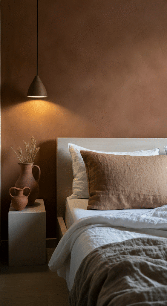
Terracotta brings an organic richness that instantly transforms a minimal space into a sanctuary. Its subtle orange-brown undertones evoke the warmth of baked clay and sun-bathed soil — the essence of grounded living.
In minimalist settings, muted terracotta can be your accent wall or statement bedding shade. Pair it with neutral whites, taupe linens, or tan upholstery to balance its natural energy.
Interesting fact: The word terracotta literally means “baked earth.” Its pigments come from natural iron oxide, making it one of the oldest color materials used in human history — from pottery to architecture.
Terracotta thrives under soft, diffused lighting. It adds personality without overpowering your calm aesthetic — the perfect blend of warmth and restraint.
3. Greige – The Modern Minimalist’s Dream
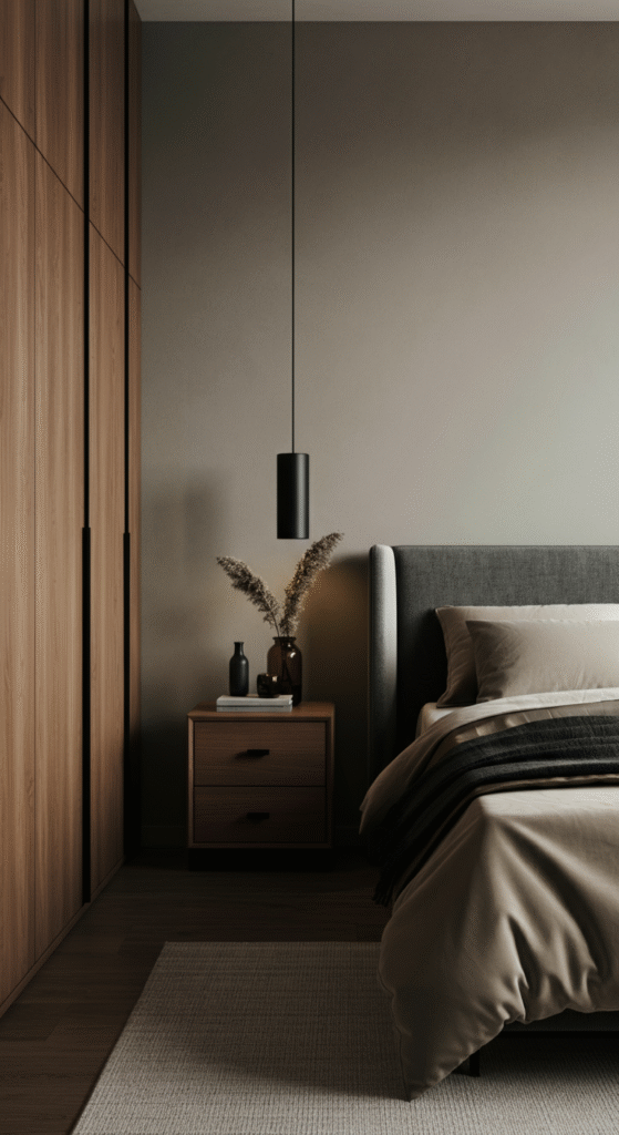
Greige (a mix of grey and beige) is the quiet luxury color of modern design. It’s not too cool, not too warm — it sits elegantly in between, like a neutral diplomat balancing both worlds.
In a minimalist bedroom, greige offers the sophistication of grey and the coziness of beige. It pairs seamlessly with warm wood furniture, cream fabrics, and black metal details.
Myth alert: Many assume grey makes a space look cold and lifeless. But when blended with beige, greige brings warmth without heaviness — making it perfect for bedrooms seeking both serenity and style.
The secret to using greige effectively? Lighting. Under warm light, it leans beige. Under daylight, it reveals soft grey undertones. That duality is what makes it timeless.
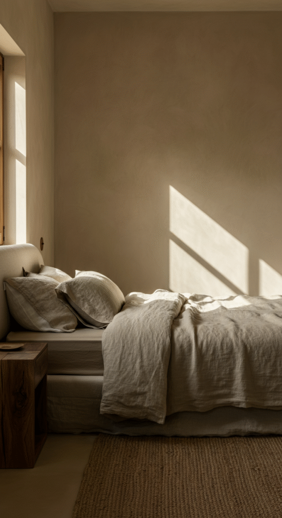
4. Clay Taupe – Subtle Depth with Character

Taupe sits quietly in the background yet adds depth you can feel. It’s that sophisticated tone that changes with light — brownish under some angles, greyish under others.
Clay taupe feels natural, like earth after rain. It’s one of the most balanced colors for a minimalist bedroom because it’s warm enough to feel inviting but neutral enough to keep things grounded.
Do you know? Taupe was named after the French word “taupe,” meaning mole — referencing the animal’s soft brown-grey fur. That’s how nuanced this shade really is.
Pair taupe with ivory, off-white, or matte black accents to give your room quiet contrast. Add a dried pampas arrangement or ceramic vase for that organic touch minimalists love.
5. Warm Greige-Brown – The Cozy Luxe Neutral
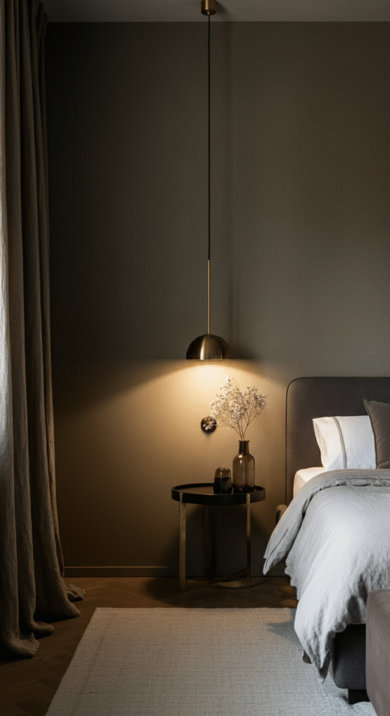
Think of this tone as a deeper, more indulgent cousin of greige. It brings the comfort of cocoa and the neutrality of beige — ideal for minimalist bedrooms that want to feel intimate without losing simplicity.
This color works beautifully for upholstered headboards, linen drapes, or soft accent rugs. Combine it with crisp whites and brass details for a subtle luxe vibe.
Interesting fact: Psychologically, brown shades are proven to reduce anxiety and induce relaxation, which explains why they’re often used in wellness retreats and spa interiors.
If your bedroom gets a lot of sunlight, warm greige-brown will reflect golden undertones during the day and shift to cozy chocolate hues by night. It’s dynamic minimalism at its best.
6. Olive Undertones – Nature’s Minimalist Soul
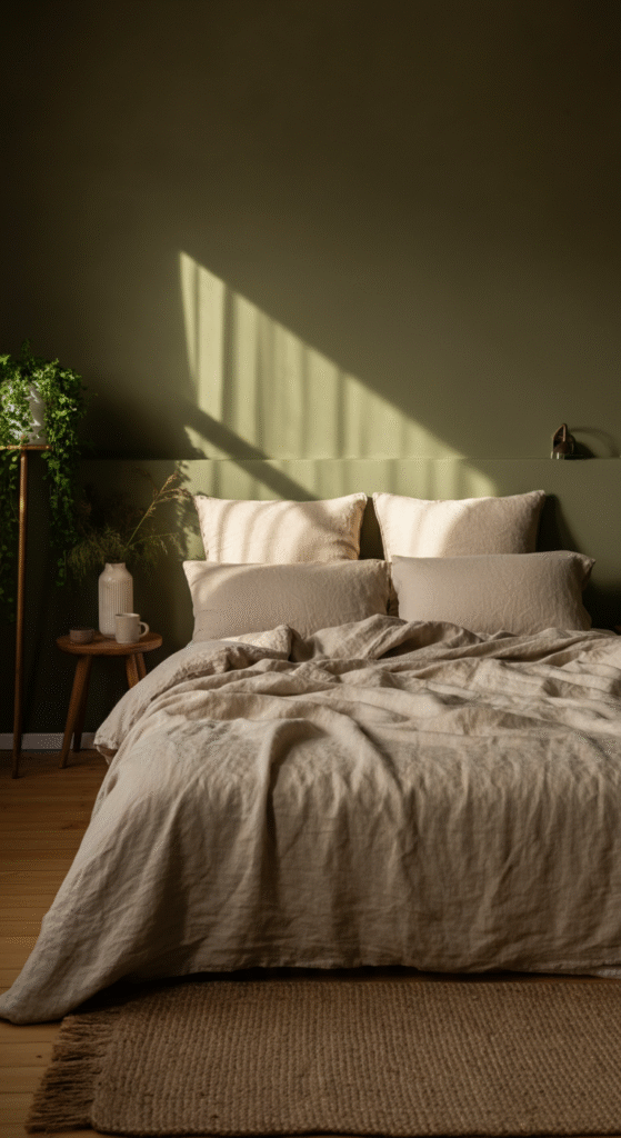
Olive may not seem “neutral” at first glance, but its earthy depth makes it a minimalist favorite. It’s the bridge between green freshness and brown warmth — organic, calm, and endlessly grounding.
Use olive tones on accent walls, cushions, or bed linen. They pair perfectly with beige, off-white, and cream tones. The result is a harmonious, nature-inspired space that feels alive yet still minimal.
Myth vs Reality: Many people think green tones don’t belong in minimalist spaces. The truth? When muted, olive becomes one of the most sophisticated neutrals you can use — subtle enough to stay timeless, yet distinct enough to stand out.
If you love indoor plants, olive walls will amplify their natural beauty without overwhelming the space. It’s a tone that makes nature feel like part of your design, not an afterthought.
7. Creamy Off-White – The Pure Blank Canvas
Minimalism and white often go hand in hand, but pure white can sometimes feel sterile. Enter creamy off-white — the warmer, softer variation that maintains brightness while adding comfort.
This tone reflects light beautifully and adapts to every style — rustic, modern, boho, or Scandinavian. It’s perfect for small bedrooms where you want openness without harshness.
Do you know? In Japanese interior design, off-white is considered the color of “ma” — a philosophy that celebrates empty space and balance. It’s not about what’s added but what’s left untouched.
Pair it with natural textures like raw wood, linen, or stone. Off-white sets the stage for your decor to breathe, creating an uncluttered calmness that defines true minimalist living.
Bonus Tip: Layering Earth Tones Like a Designer
If you want a cohesive minimalist look, think in layers of warmth rather than a single flat tone. For example:
- Start with a base like beige or off-white.
- Add depth using taupe or greige-brown on textiles or accents.
- Ground the palette with terracotta or olive touches for visual warmth.
This layered approach ensures your bedroom feels intentional — not plain. The beauty of warm neutrals lies in their ability to evolve with light, texture, and emotion.
Conclusion
Minimalism isn’t about stripping everything down to nothing — it’s about elevating what matters. And warm neutral earth tones do exactly that. They create bedrooms that feel calm yet alive, uncluttered yet rich in emotion.
From the soft sand beige that anchors your space to the creamy off-white that expands it, every tone tells a quiet story of balance and beauty. Whether you lean toward terracotta’s warmth or olive’s depth, these shades remind us that simplicity isn’t emptiness — it’s elegance refined.
Your bedroom doesn’t need to be loud to be memorable. Sometimes, the most powerful statement is silence — wrapped in warm neutrals that whisper peace every time you walk in.
Frequently Asked Questions (FAQs)
What are warm neutral colors for bedrooms?
Warm neutrals include shades like beige, taupe, terracotta, greige, and off-white — tones that bring a cozy, grounded feeling without overwhelming the space.
Are warm neutral tones suitable for small bedrooms?
Yes. These tones reflect light softly, making small rooms feel larger, brighter, and more open.
How can I make neutral tones less boring?
Play with texture — add linen, jute, rattan, or wooden elements. Layer multiple neutrals for depth instead of using one flat tone.
Do warm neutrals go well with plants?
Absolutely. Earthy tones like olive, beige, and taupe enhance the natural green of plants, creating a serene, organic vibe.
Which neutral tone feels the most luxurious?
Greige-brown or taupe often gives a subtle luxury feel, especially when paired with soft lighting and brass or wood accents.