Some links in this blog are affiliate links. If you make a purchase through these links, I may receive a small commission. This helps support the site at no extra cost to you.
Your living room is the heart of your home — a place to unwind, entertain, and create lasting memories with loved ones.
But have you ever wondered how the right color palette could transform the space entirely? The colors you choose can significantly impact the room’s vibe, making it feel warm and inviting, calming, or even energizing. In fact, it’s no surprise that color psychology plays a big role in how we experience our surroundings.
If you’re stuck on what colors to use in your living room, don’t worry! We’ve curated 20 stunning color scheme ideas that will inspire you to take your space to the next level.
From timeless classics to bold, modern combinations, these ideas will give your living room the makeover it deserves.

Table of Contents
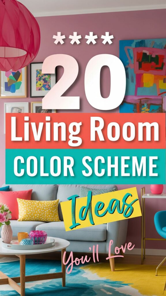
20 Best Living Room Color Scheme
1. Classic Neutral Shades: A Timeless Choice
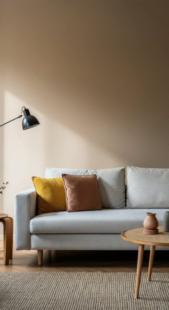
Neutral shades like beige, taupe, and light gray have been the go-to for living room decor for years, and for a good reason. These hues create a soothing, sophisticated backdrop that pairs well with almost any accent color.
Interesting Fact: Neutral colors are often chosen for their versatility, making them perfect for both modern and traditional spaces. They provide a blank canvas that allows your furniture and artwork to shine.
You can introduce pops of color with pillows, throws, or curtains to add personality and vibrancy. A neutral base can also make the space feel larger and airier, which is ideal for smaller rooms.
2. Soft Pastels: Calm and Inviting
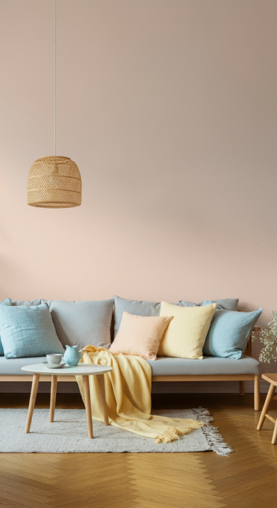
Pastels like pale blue, soft pink, and lavender bring an air of tranquility to your living room. These gentle hues are perfect for creating a calm, relaxed environment, ideal for unwinding after a long day.
Did You Know?: Pastels are often associated with feelings of serenity and peace. In fact, many spas use pastel tones in their decor to promote relaxation.
Pastel colors work well with light wood furniture, soft textiles, and minimalistic decor. These shades are also perfect for blending with both contemporary and vintage pieces.
3. Bold and Vibrant: Energize Your Space
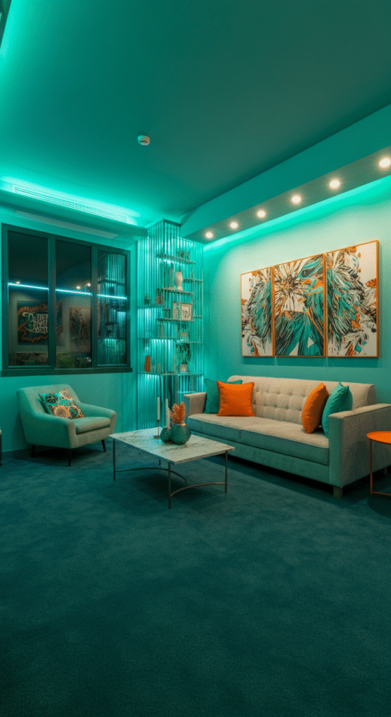
If you’re someone who loves energy and excitement, vibrant colors like bright orange, teal, and electric yellow might be just what you need. These shades can immediately energize your living room, making it feel lively and vibrant.
Myth Busted: Some people believe that bold colors make a space feel smaller. However, with the right balance and use of accents, vibrant colors can actually enhance the perception of space by adding depth and interest.
You can use bold colors in accent walls, artwork, or furniture to create a statement, while balancing them with neutral elements for a cohesive look.
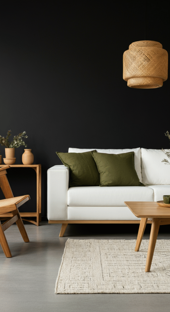
4. Earthy Tones: Natural and Grounded
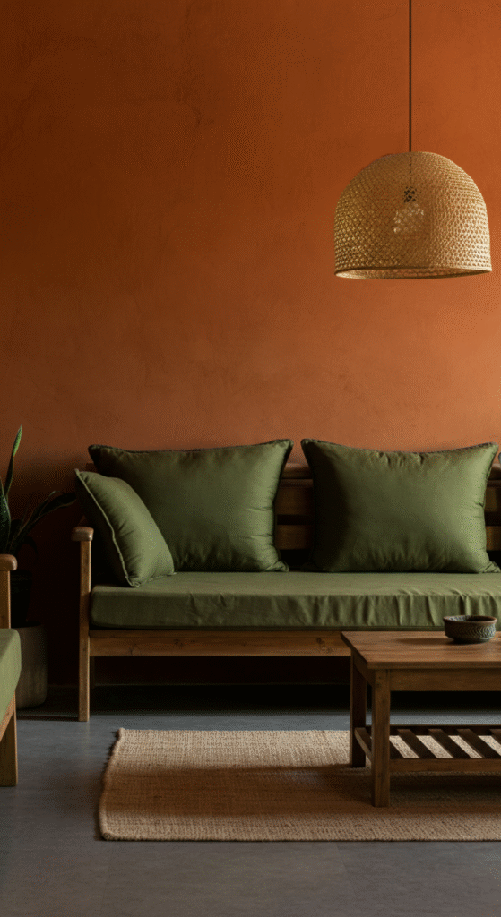
Earthy tones like terracotta, olive green, and warm browns bring the outdoors inside, offering a grounding and inviting atmosphere. These colors create a sense of warmth and comfort, perfect for a cozy living room.
Interesting Fact: Earthy tones are often linked to nature and balance. Many interior designers use these colors to evoke a sense of calm and connection with the environment.
Pair earthy tones with natural materials like wood, stone, or woven textures to enhance the natural feel of your living room.
5. Monochromatic Magic: One Color, Multiple Shades
If you love the idea of a unified and harmonious living room, a monochromatic color scheme could be perfect for you. Choose one color and play with different shades, from light to dark, to create depth and interest without overwhelming the senses.
Did You Know?: Monochromatic schemes are a favorite in modern design because they create a cohesive and sophisticated look. This design technique helps streamline the overall decor, making the room appear more organized.
You can go for a monochromatic scheme in any color — whether it’s a soothing blue or a rich burgundy — as long as you mix varying intensities of the chosen shade.
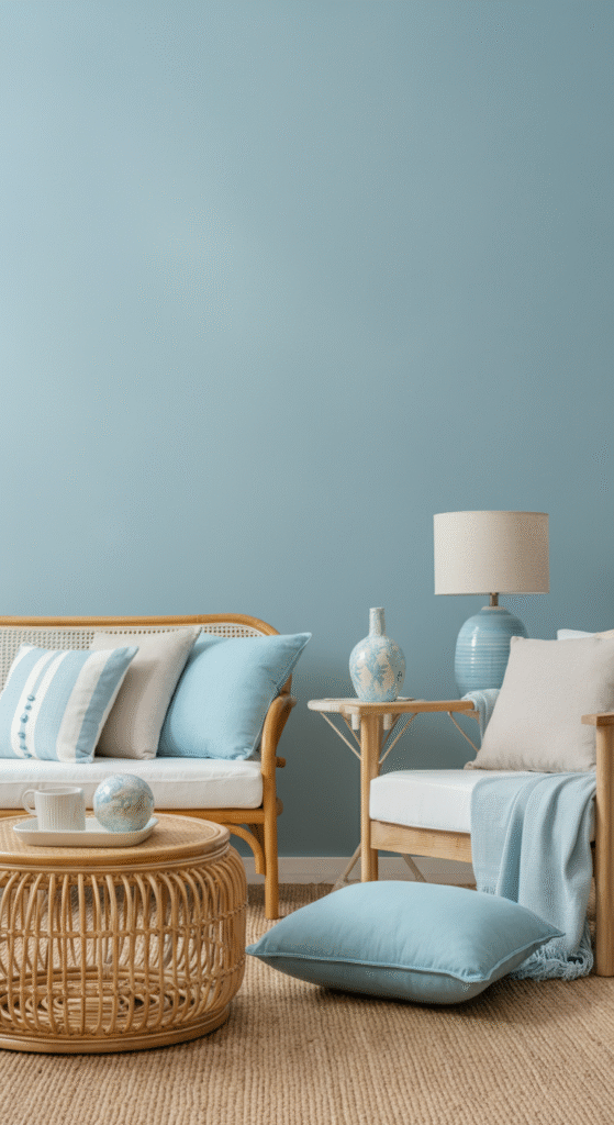
6. Coastal Vibes: Fresh and Breezy
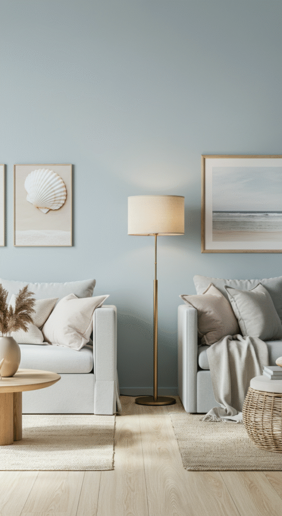
The coastal color scheme, featuring shades of light blue, white, and sandy beige, invokes a refreshing and breezy vibe. Ideal for those who love the beach and want to incorporate a relaxed, nautical aesthetic into their home.
Interesting Fact: Coastal interiors are known for making a space feel open and airy, often associated with seaside homes and beachfront properties.
Pair soft blues with whites and light grays to create a calm, serene living room reminiscent of the ocean breeze.
7. Vintage Charm: Retro and Timeless

For those who love a mix of nostalgia and style, vintage color schemes offer a timeless appeal. Think rich mustard yellow, teal, and burnt orange — colors that were popular in the mid-century era but still have a fresh, vintage charm today.
Myth Busted: Many people think vintage colors are outdated. However, when used with modern furniture and accessories, vintage color schemes can feel both nostalgic and fresh.
Vintage hues pair wonderfully with mid-century modern furniture, giving your living room a stylish yet classic look.
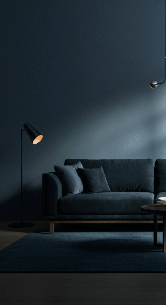
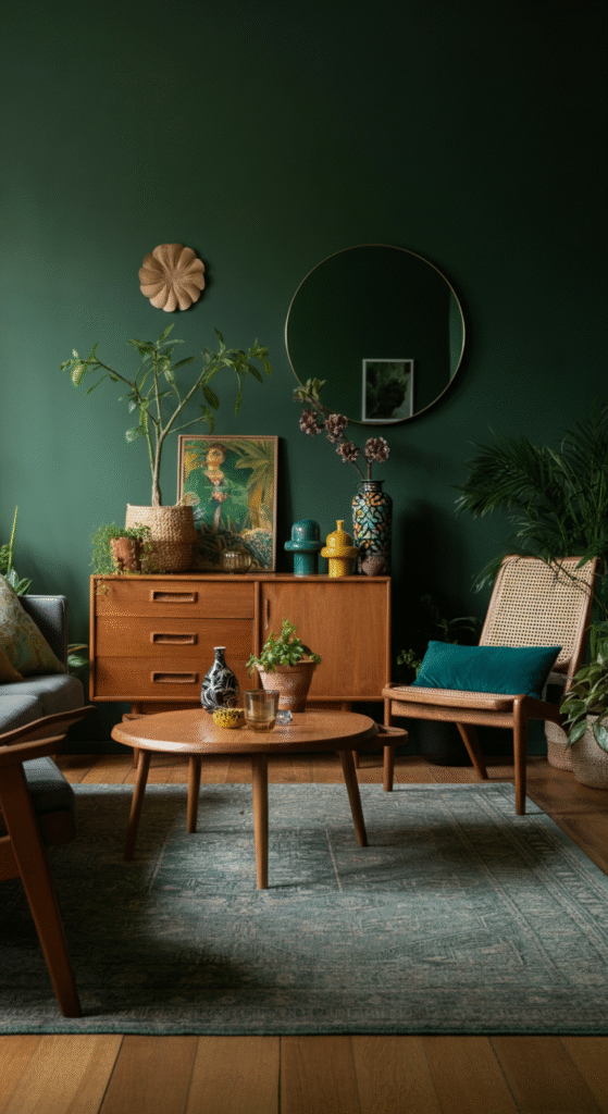
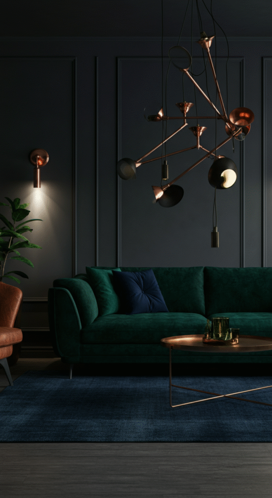
8. Moody Dark Tones: Drama and Luxury
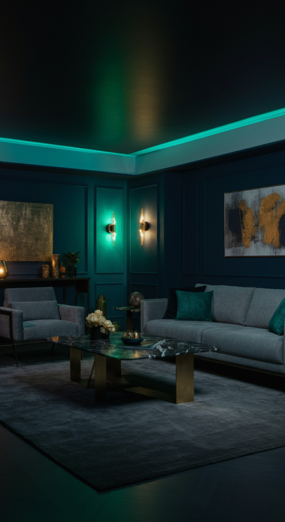
If you want to add a touch of drama and luxury to your living room, dark tones like navy blue, charcoal gray, and deep green are the way to go. These colors create a bold, sophisticated atmosphere that feels elegant and intimate.
Interesting Fact: Dark colors are often used in high-end interior design because they exude sophistication and create a sense of warmth in larger spaces.
You can balance dark tones with metallic accents, plush fabrics, and statement lighting to create a luxurious living room that feels both inviting and opulent.
9. Black and White: Classic Contrast
Nothing beats the timeless appeal of black and white. This high-contrast color scheme creates a striking visual impact that’s both bold and elegant. It’s a great option for those who love minimalist design with a touch of sophistication.
Did You Know?: Black and white is often considered the ultimate neutral combo because it works with virtually any other color. It’s also an incredibly versatile backdrop for furniture and artwork.
To soften the high contrast, incorporate textures like velvet, wood, or woven materials to add warmth and depth.
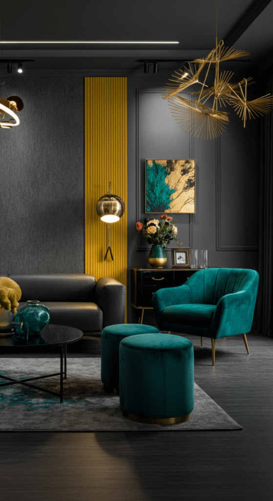
10. Jewel Tones: Opulent and Elegant
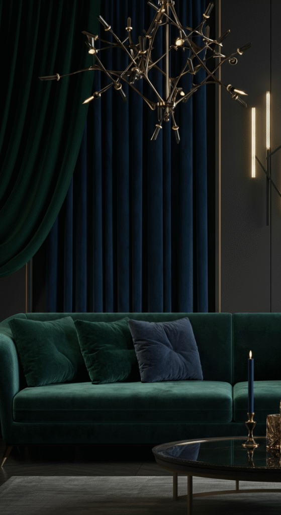
Jewel tones like emerald green, sapphire blue, and ruby red bring a regal, opulent feel to any living room. These rich hues are perfect for creating a luxurious, yet inviting atmosphere.
Interesting Fact: Jewel tones are often associated with wealth and royalty. In interior design, these colors can make a space feel grand and majestic.
Pair jewel tones with neutral furniture to allow the colors to pop. Plush velvet upholstery or rich, dark wood furniture complements these bold hues beautifully.
11. Warm Tones: Cozy and Inviting
Warm tones like golden yellow, rich red, and warm brown create an inviting atmosphere that’s perfect for a cozy, family-friendly living room. These colors make the space feel welcoming and comfortable, especially during the colder months.
Did You Know?: Warm colors are often used in spaces where you want to encourage social interaction and conversation, as they evoke feelings of warmth and connection.
Incorporate warm-toned rugs, throws, and cushions to tie the room together.
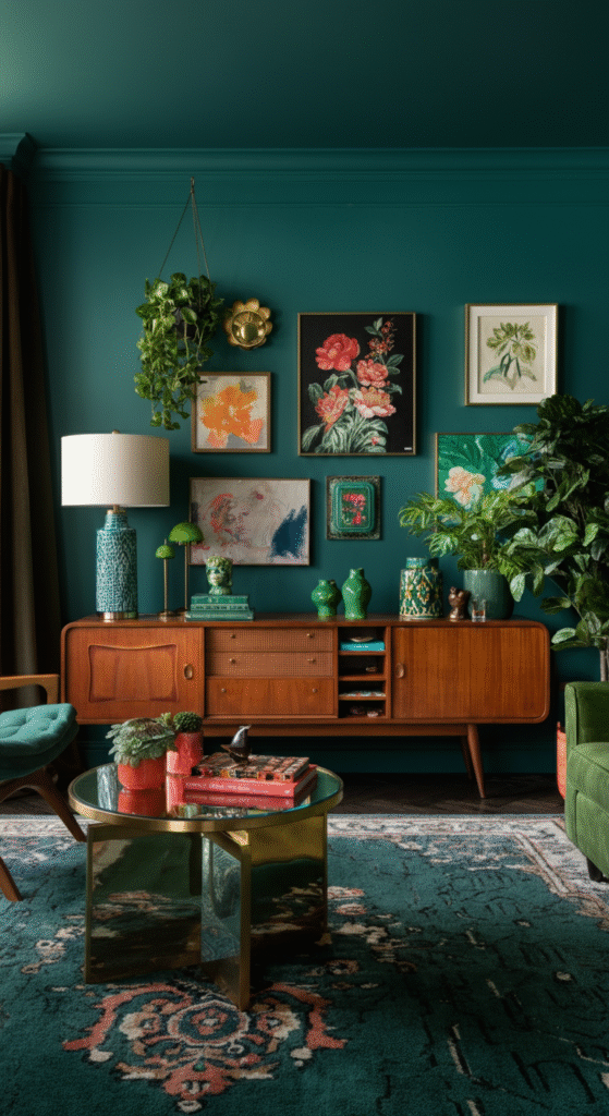
12. Greenery and Natural Shades: Refreshing and Alive
Bringing nature indoors is always a great idea, and colors inspired by greenery and plant life can do wonders for your living room. Shades of deep green, moss, and sage will create a refreshing and revitalizing space.
Interesting Fact: Green is known for its calming effects, and it symbolizes growth and renewal. It’s also a great color for promoting focus and concentration, making it ideal for spaces where you want to relax and recharge.
Pair these colors with natural wood furniture and plenty of indoor plants for a space that feels fresh and alive.
13. Gray and Yellow: A Modern Twist
If you’re looking for a modern and playful color combo, try pairing gray with yellow. This combination balances the neutrality of gray with the bright, energetic vibe of yellow, creating a stylish and welcoming atmosphere.
Did You Know?: Yellow is often associated with happiness and optimism. It’s a great way to infuse your living room with a positive, cheerful energy.
You can use gray as the base color for walls or furniture and add pops of yellow in your accessories, such as pillows, artwork, and vases.
14. Blush Pink and Gold: Soft and Elegant
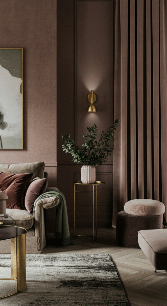
For a softer, more romantic living room, consider using blush pink and gold. This combination exudes elegance, with pink offering a warm, feminine touch, and gold bringing in a sense of luxury.
Interesting Fact: Blush pink is known for its soothing qualities, while gold is associated with wealth and opulence. Together, they create a refined, sophisticated look.
Incorporate blush pink in your walls, throw pillows, or curtains, and use gold accents in lighting fixtures, mirrors, or furniture.
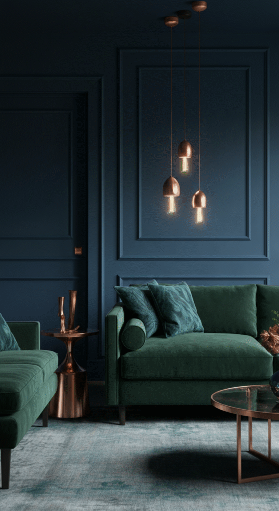
15. Charcoal and Copper: Industrial Meets Chic
If you love the industrial look, combine charcoal gray with warm copper for a chic, modern living room. Charcoal provides a sleek, neutral backdrop, while copper adds warmth and a hint of glam.
Myth Busted: Many think industrial styles are cold and uninviting. However, incorporating warm metallics like copper can make an industrial space feel cozy and stylish.
Pair these tones with sleek, modern furniture and exposed light fixtures for a contemporary living room that still feels inviting.
16. Terracotta and Olive: Earthy and Cozy
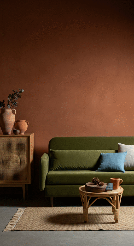
For a grounded, earthy feel, combine terracotta with olive green. These warm, natural colors create a cozy, inviting space that feels earthy and serene.
Interesting Fact: Terracotta, the color of fired clay, is often used in Mediterranean-inspired designs. It evokes a sense of warmth and connection to the earth.
Add texture through woven rugs, wicker furniture, or ceramics to enhance the earthy vibe.
17. Teal and Coral: Playful and Bold
For those who enjoy a bit of fun, teal and coral make a striking combination. Teal offers a cool, calming vibe, while coral brings a burst of energy and warmth.
Did You Know?: Teal is considered a color of balance and calm, while coral is associated with warmth and excitement. Together, they create a perfect balance of tranquility and liveliness.
Use teal for larger areas like walls or couches, and accent with coral pillows, throws, or art pieces for a playful, yet balanced look.
18. Navy Blue and Gold: Elegant and Classic
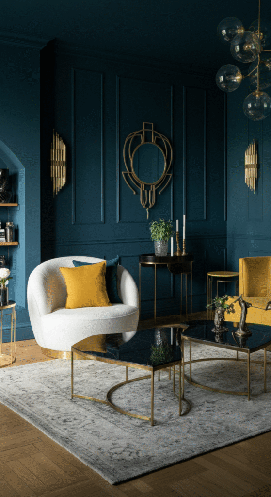
For a more refined look, pair navy blue with gold accents. This luxurious combination is timeless and exudes a sense of elegance and sophistication.
Interesting Fact: Navy blue is a color of stability and strength, while gold is often associated with luxury and success. Together, they create a royal, dignified atmosphere.
Use navy blue for your main furnishings, and incorporate gold through picture frames, lighting, or other small decorative items.
19. Lavender and Silver: Light and Dreamy
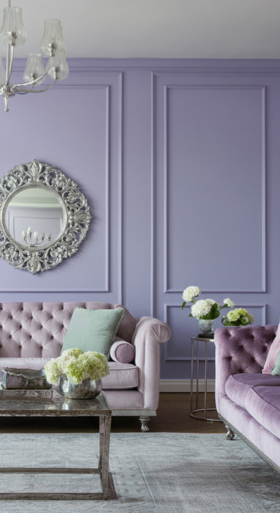
If you want a dreamy, calming vibe, lavender and silver are the perfect pairing. Lavender brings a soft, romantic atmosphere, while silver adds a touch of sparkle and elegance.
Did You Know?: Lavender is often used in bedrooms for its relaxing properties. It’s also a great color for creating a serene environment.
This color scheme works beautifully in modern, minimalist spaces, especially when paired with sleek silver accents and light wood furniture.
20. Midnight Blue and White: Timeless Elegance
Midnight blue paired with white creates a dramatic and elegant atmosphere in any living room. This bold combination feels both modern and classic, with a sense of sophistication.
Interesting Fact: Midnight blue is a deep shade of navy that evokes feelings of depth and mystery. Paired with white, it creates a balanced, timeless look.
Conclusion
Choosing the perfect color scheme for your living room can completely transform the atmosphere of your space.
Whether you prefer soothing pastels, bold contrasts, or earthy tones, there’s a color combination that fits every style and personality.
Don’t be afraid to experiment and add your personal touch with accents, furniture, and artwork. Your living room is your space — make it a place you love to relax and entertain in!
Frequently Asked Questions (FAQs)
What color scheme is best for a small living room?
For smaller living rooms, lighter colors like soft neutrals (light grays, whites, beige) can make the space feel larger and airier. Additionally, using a monochromatic color scheme or light pastel shades can help create a sense of openness. Avoid dark, heavy colors that can make the space feel cramped.
Can I mix different color schemes in my living room?
Yes! Mixing different color schemes can work if done thoughtfully. Consider using one dominant color for the walls and large furniture pieces, and then incorporate complementary or contrasting accent colors through smaller decor elements like pillows, curtains, and artwork.
Are bold colors suitable for living rooms?
Bold colors like navy, red, or vibrant yellow can definitely work in living rooms! They create a statement and energize the space. To keep the room from feeling overwhelming, balance bold tones with neutral furniture and accents.
How do I choose a color scheme for my living room?
Choosing a color scheme depends on the mood you want to create, the size of the room, and your personal style. Start by considering your existing furniture and decor. If you want a calm space, go for cool tones like blues and greens. If you prefer a warm, cozy environment, try earthy tones like terracotta or warm browns.
What are some color combinations to avoid in living rooms?
Avoid using too many contrasting colors in the same space, as it can create visual chaos. For example, pairing neon green with bright orange or combining too many bold, saturated colors can make the room feel cluttered. Stick to a more balanced palette with a mix of neutrals and accent colors.