Some links in this blog are affiliate links. If you make a purchase through these links, I may receive a small commission. This helps support the site at no extra cost to you.
Did you know that the colors in your living room can actually influence your mood and energy levels? While it might sound like a myth, psychologists and interior designers agree that color has a profound impact on how we feel.
From calming blues that help you unwind after a hectic day to vibrant yellows that spark creativity and optimism, your living room’s palette can either uplift your spirits or drain your energy.
Choosing the right combination isn’t just about aesthetics; it’s about creating a space that supports your mental and emotional well-being.
In this guide, we’ll explore 15 living room color palettes designed to boost mood, create balance, and make your space feel both inviting and energizing.
Whether you love neutral tones, bold contrasts, or soft pastels, there’s a palette here to transform your living space into a haven of happiness.
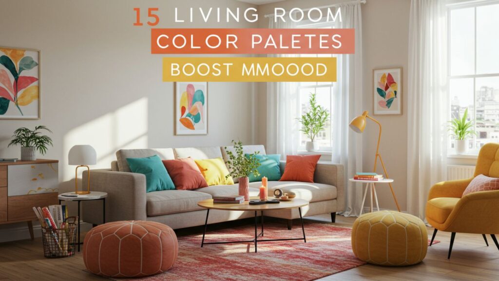
Table of Contents
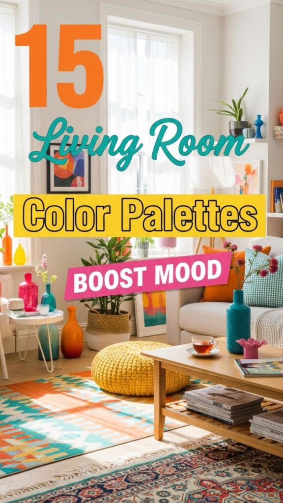
15 Best Living Room Color Palettes
1. Soft Blue and Cream: Calm and Serene
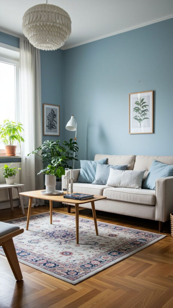
A soft blue paired with creamy whites creates a serene, peaceful environment. Blue is known to lower stress and promote relaxation, while cream tones add warmth and comfort.
Do you know? Studies show that blue environments can lower blood pressure and heart rate, making them perfect for unwinding in the evenings.
Decor tips: Use cream-colored furniture with soft blue walls or add blue cushions and rugs for subtle harmony.
2. Sunny Yellow and Gray: Energizing Yet Balanced
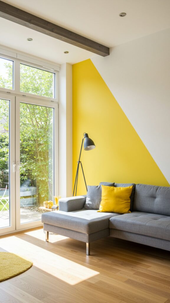
Yellow is the color of joy and optimism, and pairing it with neutral gray balances its intensity. This combination is perfect for energizing the mind without overwhelming the senses.
Fun fact: People exposed to yellow tones often report feeling more cheerful and focused, making it a great choice for lively gatherings or creative work.
Tip: Consider gray sofas with yellow accent walls or yellow décor pieces like vases and throw pillows.
3. Earthy Green and Beige: Nature-Inspired Comfort
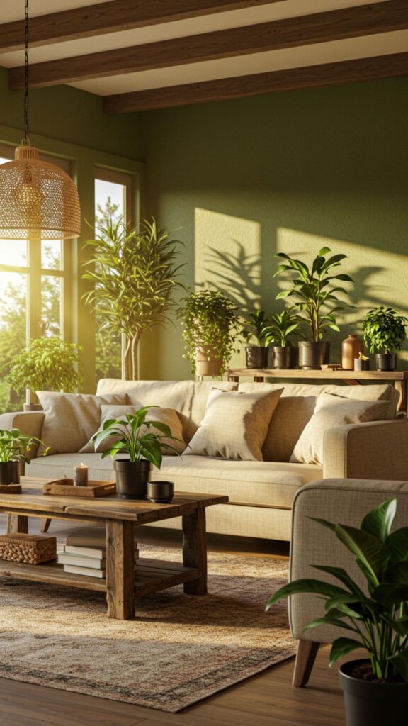
Green is the color of nature and renewal, promoting calmness and emotional balance. Combined with beige, it gives your living room a grounded, cozy feel.
Did you know? Studies in color psychology reveal that green reduces anxiety and boosts concentration—perfect for reading corners or home offices.
Decor idea: Incorporate indoor plants with green walls and beige furniture for a natural vibe.
4. Coral and White: Uplifting and Inviting
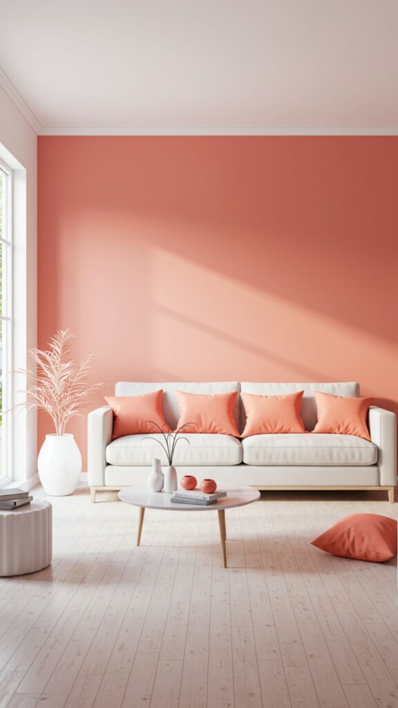
Coral brings warmth and friendliness to your living room, while white keeps the space fresh and airy. This palette creates a welcoming environment that encourages conversation and socializing.
Interesting fact: Coral is associated with warmth, playfulness, and positive energy, making it ideal for family living spaces.
Tip: Use coral cushions, curtains, or a feature wall alongside crisp white furniture.
5. Deep Navy and Gold: Luxurious Calm
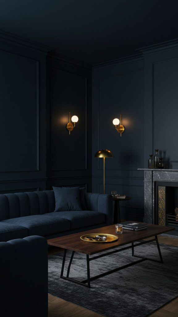
Navy is a color that evokes depth, stability, and calm, while gold accents add a touch of luxury and sophistication. This palette is perfect for creating a cozy yet elegant living room.
Do you know? Navy walls can make a room feel more intimate and grounded, especially when paired with metallic touches.
Decor advice: Think navy upholstered sofas with gold light fixtures or coffee tables for a chic ambiance.
6. Lavender and Soft Gray: Relaxation Meets Elegance
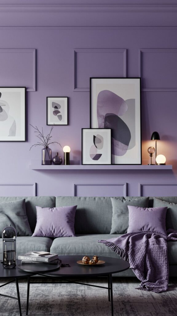
Lavender is known for its calming properties, and soft gray balances its softness, resulting in a refined and relaxing environment.
Myth busted: Some believe purple is too bold for living rooms, but in soft shades like lavender, it promotes tranquility and luxury without being overpowering.
Tip: Lavender cushions, throws, or wall accents paired with gray furniture enhance mood and comfort.
7. Peach and Taupe: Warm and Comforting
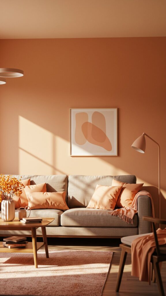
Peach exudes warmth and positivity, while taupe grounds the room with subtle neutrality. This palette is perfect for cozy, welcoming living rooms.
Interesting fact: Peach is psychologically linked to comfort and optimism, making it a great choice for spaces meant for family bonding.
Decor idea: Pair peach-colored walls with taupe sofas, or use peach décor items like lamps and rugs.
8. Teal and Mustard: Bold and Playful
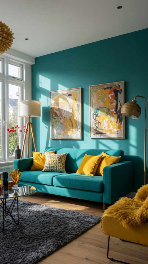
Teal offers serenity while mustard adds cheerfulness, creating a palette that’s both bold and balanced. This combination is great for creative, lively living spaces.
Do you know? Teal is associated with clarity of thought, while mustard can stimulate mental activity and energy.
Tip: Teal sofas with mustard cushions or rugs can make your living room pop with personality.
9. Soft Pink and White: Gentle and Cheerful
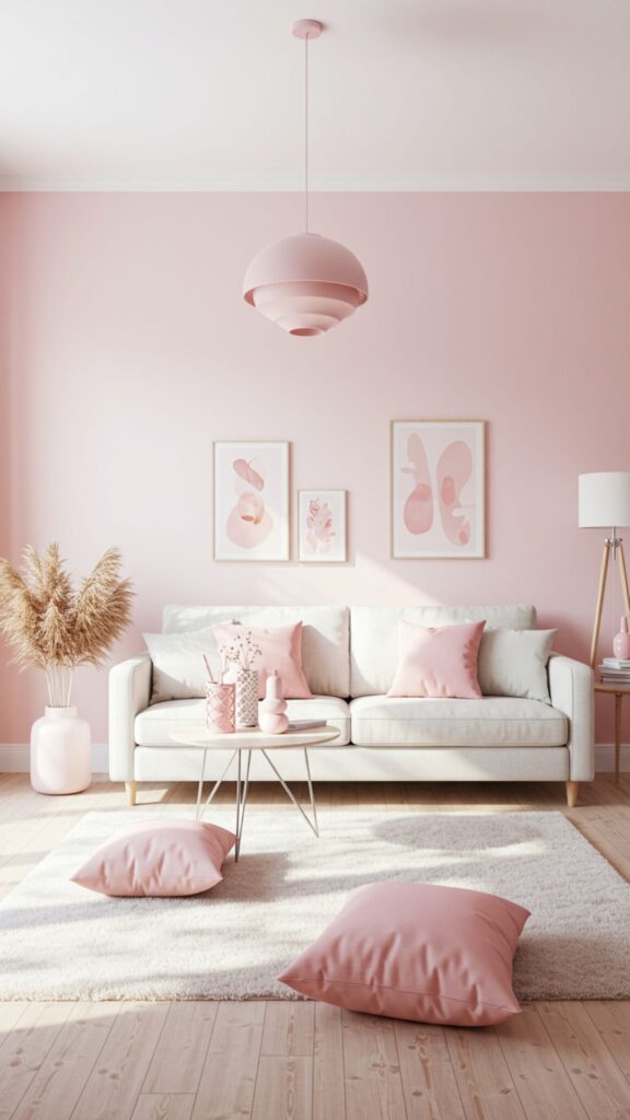
Soft pink adds warmth and tenderness, and when paired with white, it creates a light, airy, and uplifting atmosphere.
Fun fact: Pink interiors are often linked to feelings of love, compassion, and positivity.
Decor tip: Use white walls with pink accents in pillows, throws, or artwork to brighten up the space.
10. Charcoal and Light Wood: Modern Calm
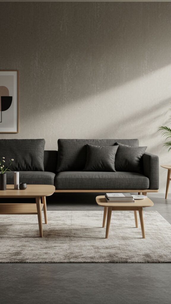
Charcoal gray paired with light wood tones results in a contemporary yet cozy palette. The contrast between the dark and light creates depth without overwhelming the senses.
Interesting fact: Dark shades like charcoal can foster focus and concentration, while wood textures bring natural warmth.
Tip: Charcoal sofas with wooden furniture or shelving create a stylish, grounded vibe.
11. Mint Green and White: Refreshing and Airy
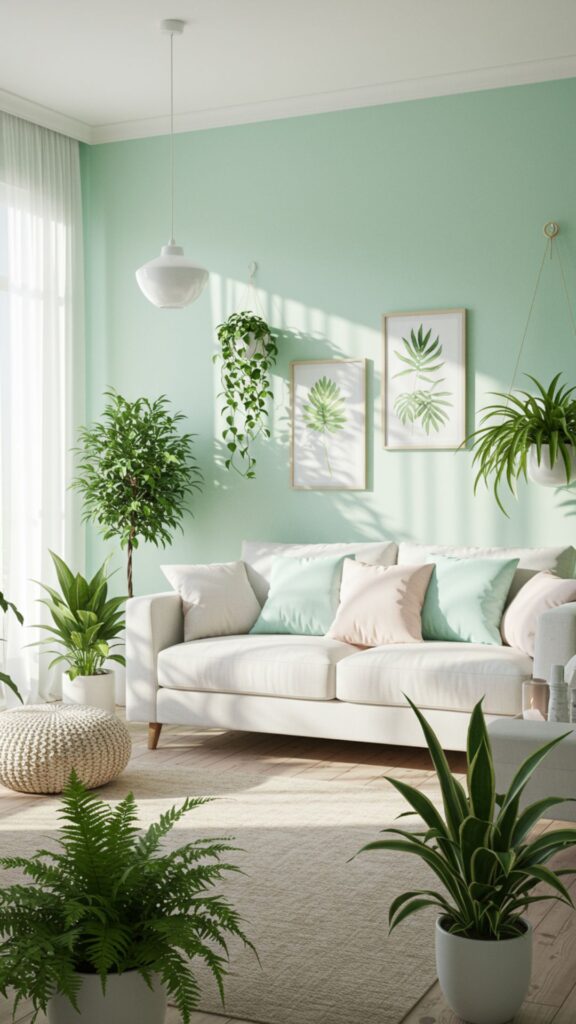
Mint green promotes freshness and rejuvenation, while white keeps the room clean and bright. This combination is perfect for uplifting morning moods.
Do you know? Green shades, especially mint, are often associated with renewal and optimism, making them ideal for energizing living areas.
Decor idea: Mint walls with white furniture or accessories like cushions and lamps.
12. Rust and Cream: Cozy and Inviting
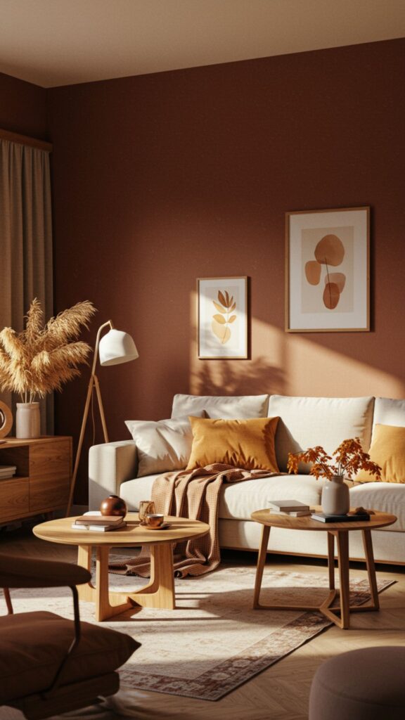
Rust shades bring warmth and sophistication, paired with cream for balance. This palette is perfect for autumn-inspired living rooms that feel inviting year-round.
Fun fact: Earthy tones like rust can make people feel more secure and grounded, enhancing relaxation.
Tip: Use rust-colored curtains or rugs with cream furniture to make the space cozy.
13. Sky Blue and Soft Yellow: Cheerful Serenity
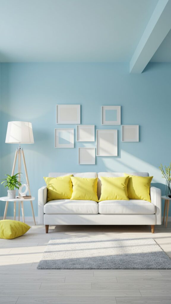
Sky blue evokes calmness and peace, while soft yellow adds a hint of energy and happiness. This combo works well for spaces where relaxation meets lightheartedness.
Did you know? Exposure to blue and yellow together can improve mood and stimulate positive thinking.
Decor tip: Soft yellow cushions on a sky-blue sofa or blue walls with yellow décor accents.
14. Warm Taupe and Blush: Sophisticated and Gentle
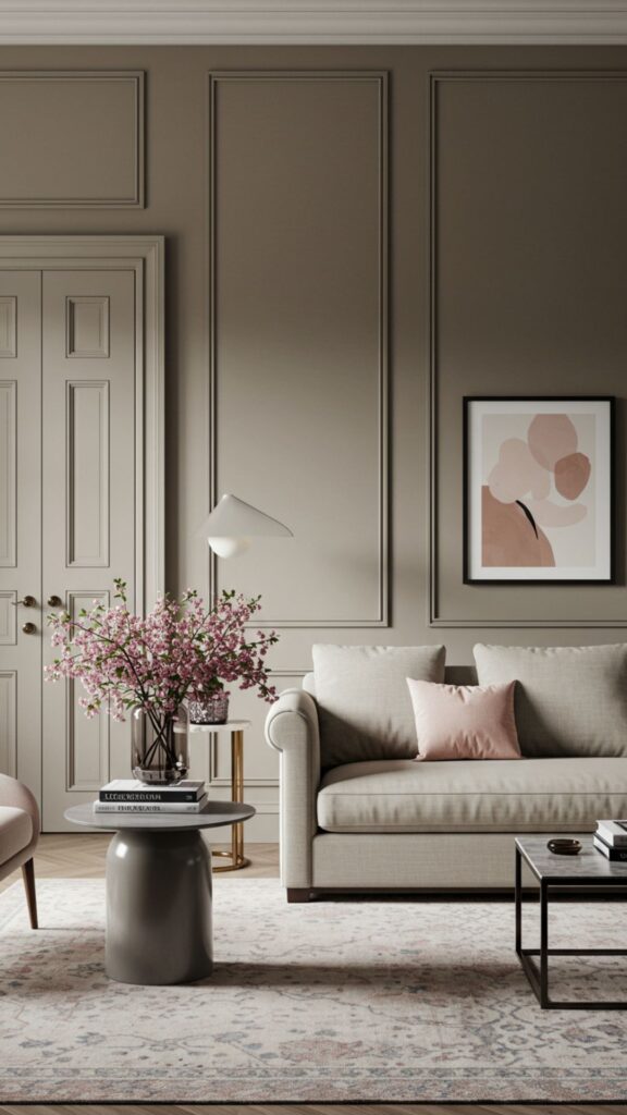
Taupe provides a grounding effect, while blush introduces subtle warmth and elegance. Together, they create a sophisticated yet comforting living space.
Interesting fact: Blush tones can evoke feelings of warmth and comfort, perfect for creating a nurturing environment.
Tip: Use taupe walls with blush accents in décor and fabrics.
15. Olive Green and Terracotta: Earthy and Energizing
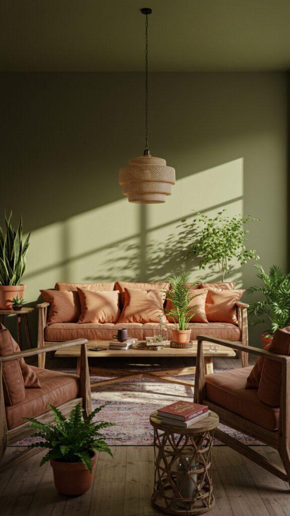
Olive green grounds your living room, while terracotta adds warmth and vitality. This palette balances energy with stability, making your space feel both vibrant and calming.
Do you know? Earthy tones like olive and terracotta have been linked to mental well-being and a sense of connectedness with nature.
Decor idea: Olive walls with terracotta cushions, pottery, or rugs for an earthy, mood-boosting ambiance.
Conclusion: Transform Your Living Room, Transform Your Mood
Your living room isn’t just a place for furniture—it’s a space that can influence how you feel every day.
Choosing the right color palette can uplift your mood, energize your mind, and create a welcoming environment for both you and your guests.
From calming blues and greens to energizing yellows and terracottas, the right combination can make a significant difference in your daily life.
Take inspiration from these 15 palettes, experiment with accents, and don’t be afraid to mix textures and tones.
Your living room should be more than beautiful—it should be a space that nourishes your well-being, sparks joy, and makes every moment at home feel special.
Frequently Asked Questions (FAQs)
How do colors in a living room affect my mood?
Colors can influence emotions and energy levels. Warm tones like yellow and coral can uplift your mood, while cool tones like blue and green promote relaxation and calmness.
Can I mix more than two colors in a living room palette?
Yes, but it’s best to stick to a primary color and one or two accent colors to maintain balance. Too many colors can make a room feel chaotic.
Which color palette is best for a small living room?
Light and neutral tones, such as soft blues, creams, or blush, can make small spaces appear larger and more open while maintaining a calm atmosphere.
Are dark colors suitable for a living room?
Dark colors like navy, charcoal, or deep green can work beautifully in living rooms, especially when balanced with lighter tones and good lighting. They create depth, intimacy, and a cozy feel.
How can I use bright colors without overwhelming the room?
Use bright colors as accents through pillows, rugs, curtains, or artwork rather than painting all walls. Pair them with neutral or soft tones for balance.