Some links in this blog are affiliate links. If you make a purchase through these links, I may receive a small commission. This helps support the site at no extra cost to you.
When it comes to creating a living room that radiates timeless elegance, few elements matter more than the color scheme. Choosing the right colors can completely transform a space, infusing it with warmth, charm, and style.
Whether you’re decorating a small city apartment or a sprawling country home, the colors you choose can set the tone and elevate your living room to new heights. But with so many shades and trends to choose from, how do you pick the right one?
In this guide, we’ll explore twelve living room color schemes that have stood the test of time and remain as elegant and stylish today as they were decades ago. These are the color combinations that never go out of fashion, offering both sophistication and comfort.
Keep reading to discover which of these classic color palettes could be the perfect backdrop for your home.

Table of Contents
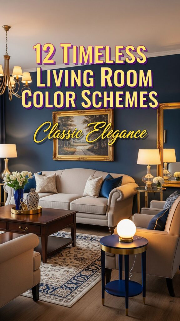
12 Timeless Living Room Color Schemes To Do
1. Classic White and Off-White
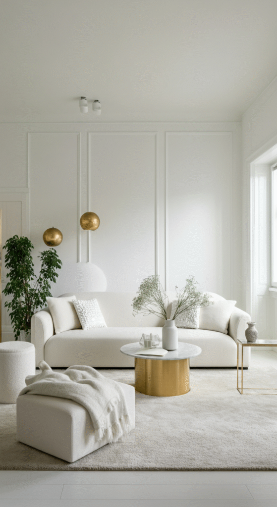
When in doubt, you can never go wrong with white. The classic white and off-white combination is a staple in design because of its versatility and timeless appeal. It’s a color scheme that works in any space, from the smallest urban apartments to grand, sunlit living rooms.
White reflects light, making the room feel larger and more open. Pair white walls with off-white or cream furniture, and accent with silver or gold accessories to give the room a sophisticated, refined look.
Do you know? White is often associated with purity, simplicity, and freshness. It’s a perfect choice if you want a minimalist, clean, and airy living room.
You can also add pops of greenery with houseplants to create a welcoming and balanced atmosphere. These subtle accents can make the space feel more alive and vibrant.
2. Soft Beige and Taupe
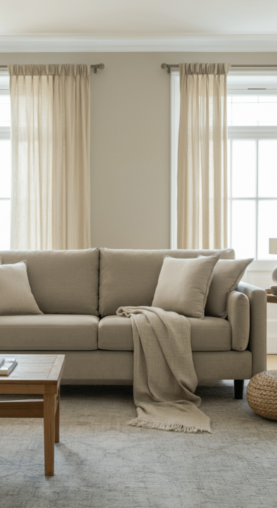
Beige and taupe are perfect for creating a cozy and warm environment, making them ideal for living rooms. This color palette exudes elegance without being too bold. The warmth of beige paired with the grounded tones of taupe creates a calm and inviting space.
These colors are also easy to pair with a variety of accent colors, from deep jewel tones to soft pastels. They allow flexibility in your design choices, letting your furniture and decor truly shine.
Myth: Some people believe that beige and taupe are dull or boring, but the truth is, these colors are incredibly versatile. They serve as a perfect backdrop to highlight other elements in the room, such as art, textiles, and architectural details.
This scheme is particularly ideal if you want a neutral base that you can easily update with changing trends or seasonal decorations.
3. Navy Blue and White
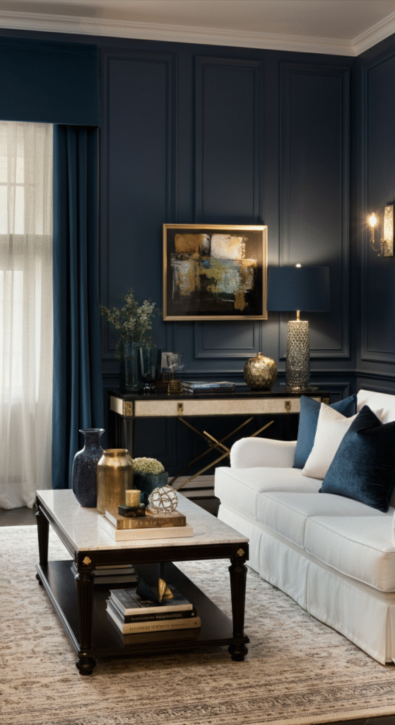
For a sophisticated, yet fresh look, consider pairing navy blue with crisp white. This color combination evokes a sense of timeless nautical elegance, while remaining polished and modern. Navy blue works well in both contemporary and classic settings.
Interesting Fact: Navy blue is a color that has been linked to stability and strength. It’s been a popular color in the world of fashion and interior design for centuries due to its regal and commanding presence.
In your living room, navy blue accents on walls, furniture, or curtains can bring a sense of structure, while white softens the overall feel. This combination gives a sense of balance and harmony that works well in almost any home.
4. Soft Gray and Charcoal
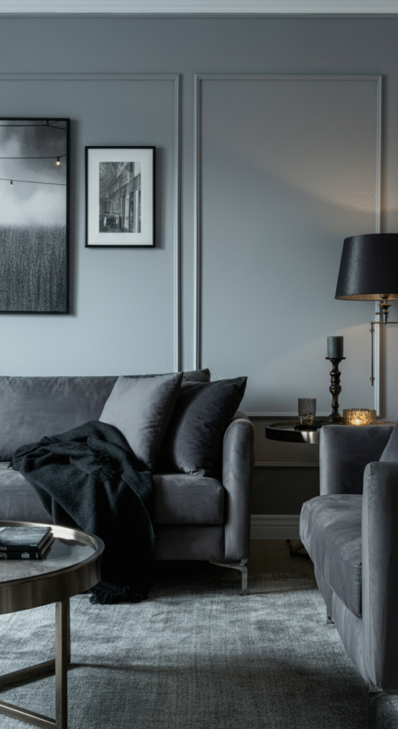
Gray is often perceived as a neutral, but when used thoughtfully, it can add depth, elegance, and sophistication to any living room. A combination of soft gray and deep charcoal creates a refined, contemporary look that’s still warm and inviting.
Did you know? Gray is often used to balance brighter colors, as it allows bolder tones to stand out without overwhelming the space. In your living room, consider incorporating plush gray sofas with charcoal accent walls or throw pillows for a sophisticated yet welcoming atmosphere.
Gray also serves as an excellent backdrop for other vibrant accent colors like mustard yellow, navy, or burnt orange, allowing those colors to pop without overwhelming the room.
5. Earthy Green and Brown
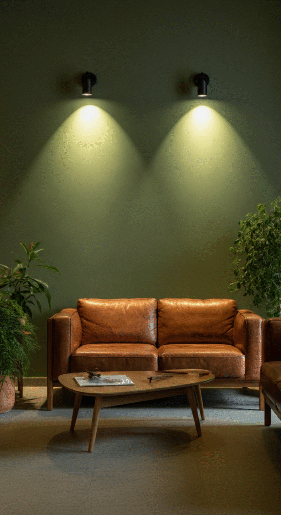
Inspired by nature, the earthy green and brown color combination brings a sense of peace and tranquility to the living room. Green symbolizes growth and renewal, while brown grounds the space with its natural, earthy tones. Together, they create a soothing atmosphere.
This combination is perfect for creating a warm, rustic look, especially when combined with wood elements like furniture, flooring, or accent pieces. Adding plants or natural textiles can enhance the earthy feel.
Fun Fact: Green is considered to be the most restful color for the eyes. It’s a great choice for spaces where you want to unwind and relax. Brown tones further complement this calm environment, adding depth and warmth without overpowering the space.
The earthy tones can also be paired with lighter accent colors like cream or white to soften the look and prevent the room from feeling too dark.
6. Cream and Gold
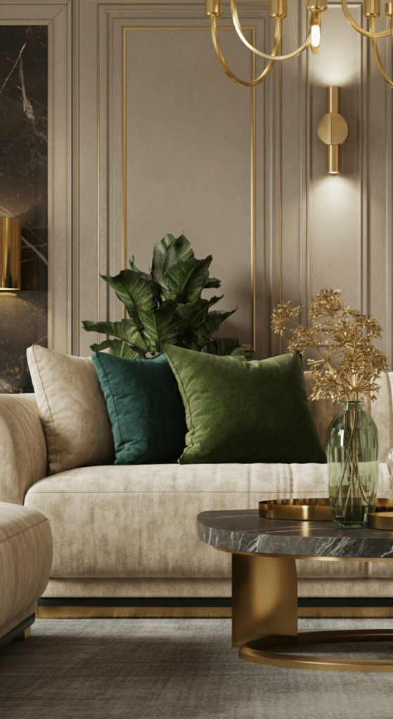
If you’re aiming for a luxurious and refined look, consider the classic combination of cream and gold. Cream offers a soft, neutral base, while gold adds warmth and a touch of opulence. This color palette is perfect for creating a high-end feel.
This color scheme works beautifully in traditional and transitional living rooms, especially when you want to create a space that feels regal yet comfortable. Gold accents can be used in light fixtures, trim, or decor to add a sense of luxury.
Interesting Fact: Gold has long been a symbol of wealth, power, and success. It brings a touch of glamour to any space, especially when paired with subtle neutrals like cream.
You can add a variety of textures like velvet cushions or silk curtains in gold to create depth and visual interest in the room.
7. Muted Lavender and Gray
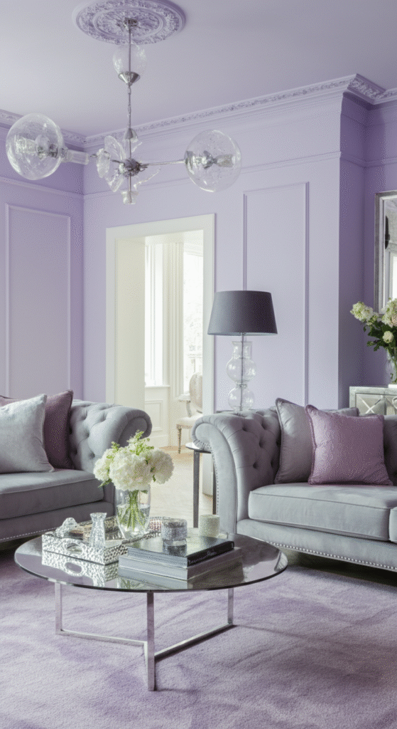
For a more subtle and serene color scheme, lavender and gray offer a refreshing yet timeless combination. Lavender is a soft, calming color that pairs beautifully with various shades of gray for a peaceful and elegant living room.
Do you know? Lavender has been historically associated with royalty and luxury, making it a perfect color choice for those who want a sophisticated, calming atmosphere. When paired with gray, lavender takes on a more modern and understated appeal.
This color combination works particularly well in spaces where you want to create a tranquil environment, perfect for relaxation. It’s ideal for spaces that blend comfort with understated luxury.
8. Black and White with a Touch of Gold
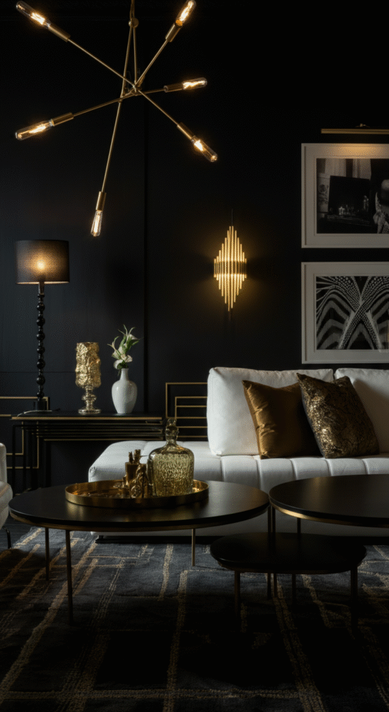
There’s nothing more classic than black and white, and when combined with gold accents, it creates a living room that is both striking and sophisticated. This color scheme offers a perfect balance between boldness and elegance.
The high contrast between black and white makes the space feel dynamic, while the gold accents add a touch of refinement and warmth. This color scheme works particularly well in modern or art-deco-inspired interiors.
Myth: Some people shy away from using black in their living room for fear that it will make the space feel too dark. However, black accents can actually enhance a room’s elegance and create a sense of drama and sophistication when paired with white and gold.
This palette allows for an artistic and chic look, perfect for those who want a living room that feels both glamorous and edgy.
9. Warm Terracotta and Beige
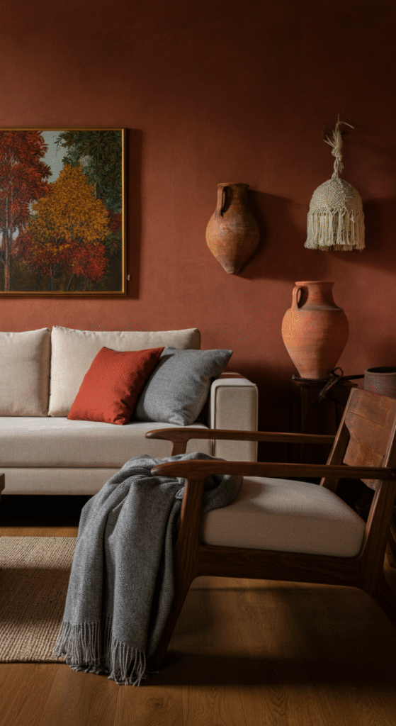
Terracotta is a rich, earthy color that brings warmth and vibrancy to any room. Paired with beige, it creates a welcoming and harmonious color scheme that feels both grounded and uplifting. This combination is perfect for Mediterranean or southwestern-inspired living rooms.
Consider terracotta-colored cushions or accent walls with beige furniture and wooden elements to add depth and balance. This color palette has a natural, rustic appeal, perfect for creating a cozy, inviting environment.
Did you know? Terracotta gets its name from the Italian words “terra” (earth) and “cotta” (cooked), referring to the fired clay that gives the color its distinct warmth.
Terracotta and beige work well with natural materials like wood, stone, and clay to create an earthy, grounded vibe.
10. Rich Burgundy and Cream
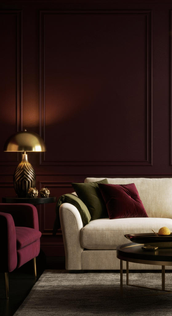
Burgundy is a deep, sophisticated color that exudes luxury and elegance. Paired with cream, it strikes the perfect balance between boldness and softness. This color palette is perfect for creating a living room that feels both luxurious and comfortable.
Burgundy has been historically associated with wine, symbolizing richness and warmth. It’s a fantastic color choice for living rooms that need a touch of drama without being overpowering.
Interesting Fact: Burgundy is often linked to autumn and winter, evoking feelings of warmth and coziness. It’s a great choice for creating a space that’s inviting and elegant, especially in colder months.
You can use burgundy in your curtains, throw pillows, or accent walls and balance it with cream-colored furniture to ensure the room doesn’t feel too dark.
11. Soft Pink and Charcoal
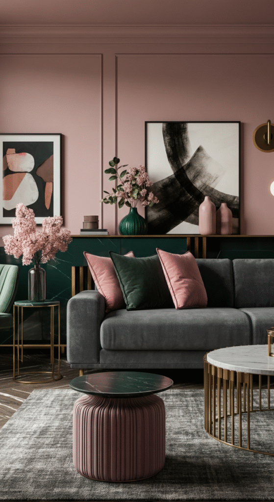
Soft pink is often thought of as a light and delicate color, but when paired with charcoal gray, it takes on a more mature and sophisticated tone. This pairing offers a balance of softness and depth, making it a great option for both modern and classic interiors.
Myth: People often associate pink with femininity, but when used in the right context, pink can work beautifully in any living room. Soft pink walls with charcoal furniture or accents can create a chic, contemporary look that still feels welcoming and cozy.
This combination is perfect if you want a unique color scheme that feels both fresh and elegant, offering a modern twist on traditional palettes.
12. Midnight Blue and Light Gray
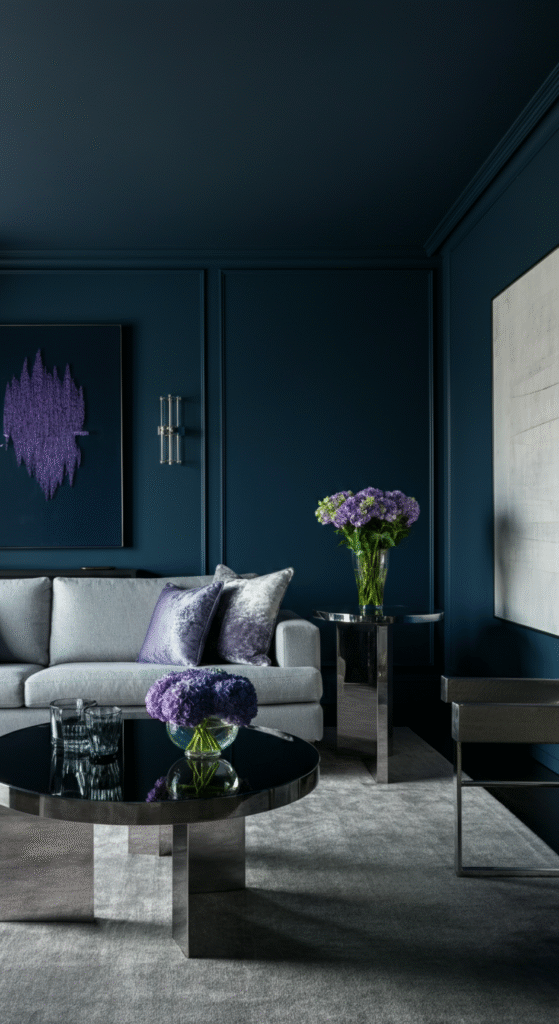
Midnight blue is a rich, deep color that evokes a sense of mystery and calm. When paired with light gray, it creates a beautiful contrast that feels both elegant and contemporary. This color scheme brings a touch of drama without feeling overpowering.
Fun Fact: Midnight blue is often considered a symbol of intelligence and confidence. It’s a perfect choice for a living room where you want to create a space that feels both luxurious and tranquil.
Pair midnight blue walls with light gray furniture and sleek metal accents for a space that feels both modern and timeless. This color combination is perfect for those who want a sophisticated, peaceful space to unwind.
Conclusion
When it comes to creating a timeless living room, color is key. Whether you prefer soft neutrals or bold, dramatic contrasts, these twelve color schemes offer classic elegance that never goes out of style.
From the airy brightness of white and cream to the deep sophistication of navy and charcoal, there’s a color palette for every taste and every home.
As you consider your own living room design, remember that the best color schemes are those that reflect your personal style while creating a space that’s welcoming, relaxing, and beautiful.
Choose colors that resonate with you, and don’t be afraid to experiment with different tones and textures until you find the perfect balance for your home.
Frequently Asked Questions (FAQs)
What is the best color for a small living room?
For a small living room, light colors like whites, soft grays, and light beiges work best. These shades can make the space feel larger and more open by reflecting light. You can also incorporate mirrors or light-colored furniture to enhance the sense of space.
Can I mix multiple bold colors in my living room?
Yes, you can mix bold colors, but it’s important to balance them with neutrals. For example, pairing navy blue with white or rich burgundy with beige can add contrast without overwhelming the room. It’s key to maintain harmony by choosing accent colors that complement each other.
How do I choose the right accent colors for my living room?
To choose the right accent colors, consider the main color of your living room and opt for shades that contrast or complement it. For example, if your walls are beige, you might choose deep blues, greens, or even rich gold for cushions, curtains, or artwork to add depth and interest.
Are dark colors good for a living room?
Dark colors like navy blue, charcoal, or deep burgundy can add elegance and drama to a living room. However, they can make the space feel smaller, so it’s best to pair them with lighter elements or use them on accent walls, furniture, or accessories rather than all over the room.
How can I add warmth to a neutral living room?
To add warmth to a neutral living room, incorporate rich tones like terracotta, golden yellows, or deep greens. Textures also play a big role—wooden furniture, plush cushions, and soft rugs can infuse warmth without overwhelming the space.